Designing for the conversation after the match, not the swipe before it.
- Industry
- Dating
- Product
- Mobile App
- Platform
- App
- Year
- 2025
01The Real Problem
Second Date is named after the thing every dating app quietly fails at. Getting a match is solved. Getting to a second date is not, and no amount of swiping improves it.
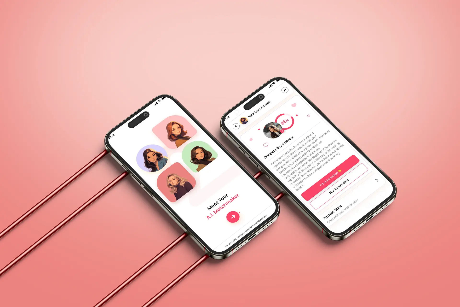
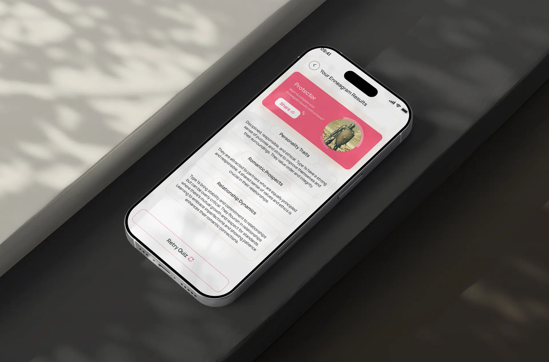
The mechanics are the cause. Rapid, appearance-led matching produces volume and very little compatibility, so people end up with a full inbox and nothing to say. The app's answer is a personality quiz that generates real compatibility insight, plus matchmakers who curate suggestions. That means the product has to do something dating apps normally avoid: explain itself.
So the design questions were:
- 01How long a quiz will people finish before they have any reason to trust you?
- 02How do you explain why two people were matched without sounding like a machine?
- 03How do you slow an app down without making it feel empty?
02Finding the Fix
The organising decision was to make the reasoning visible everywhere. If the product's claim is better matching, the interface has to show its working.
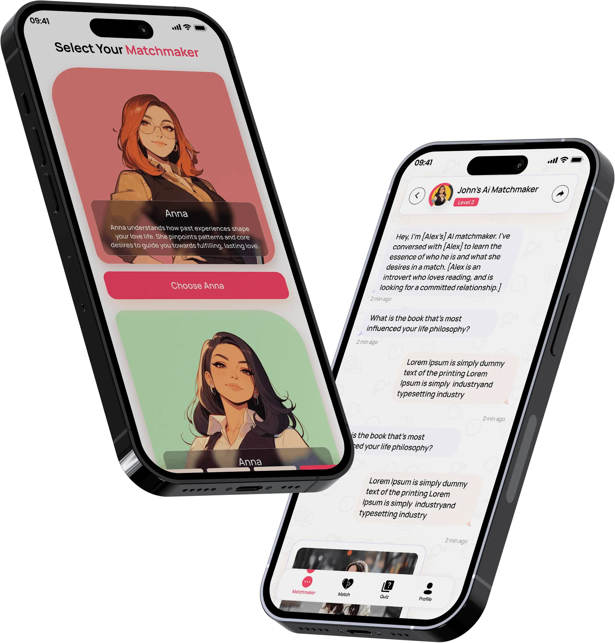
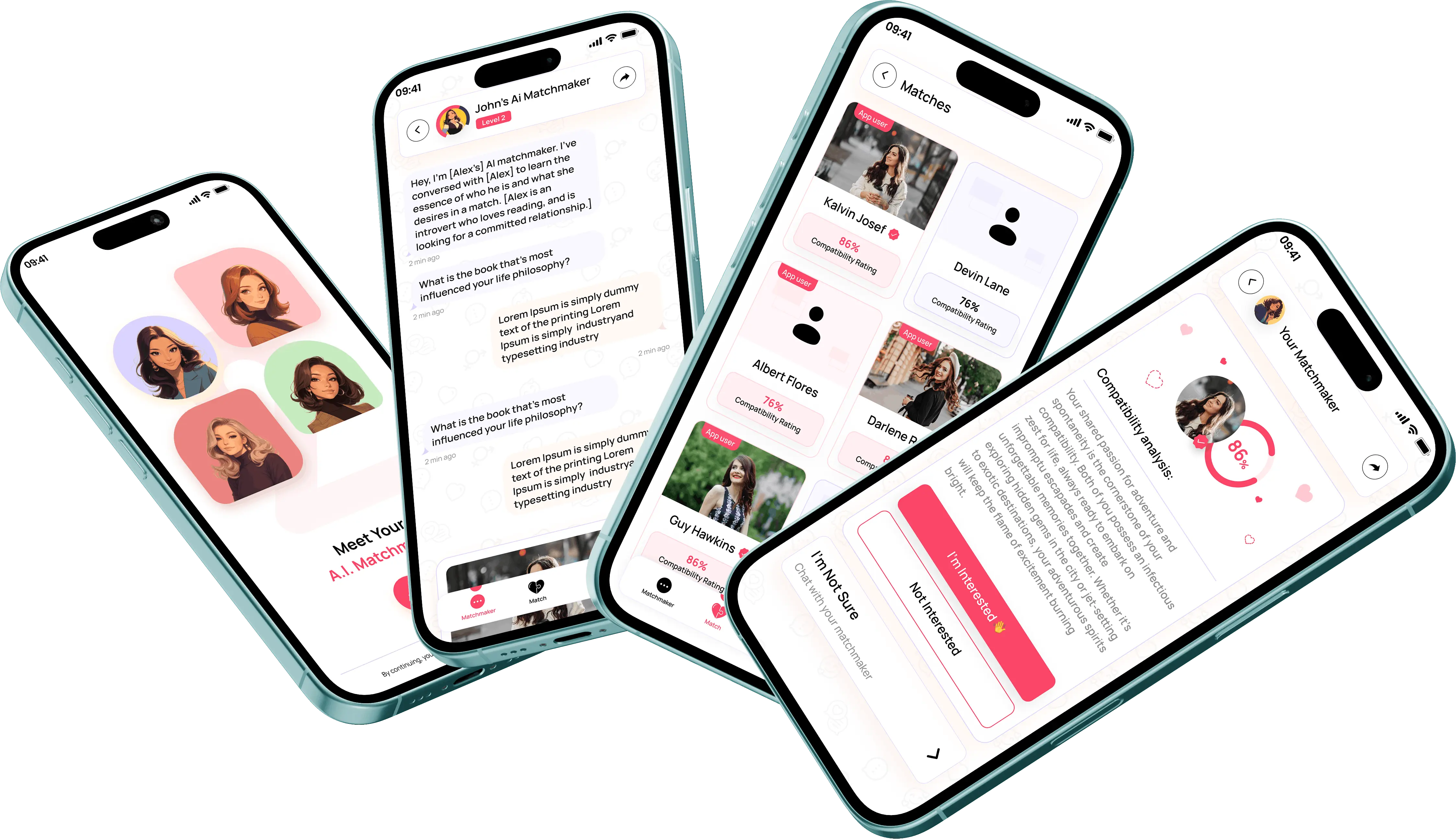
- 01Every match arrives with a reason. Written in plain language, on the card, not hidden behind a tap. The reason is the product.
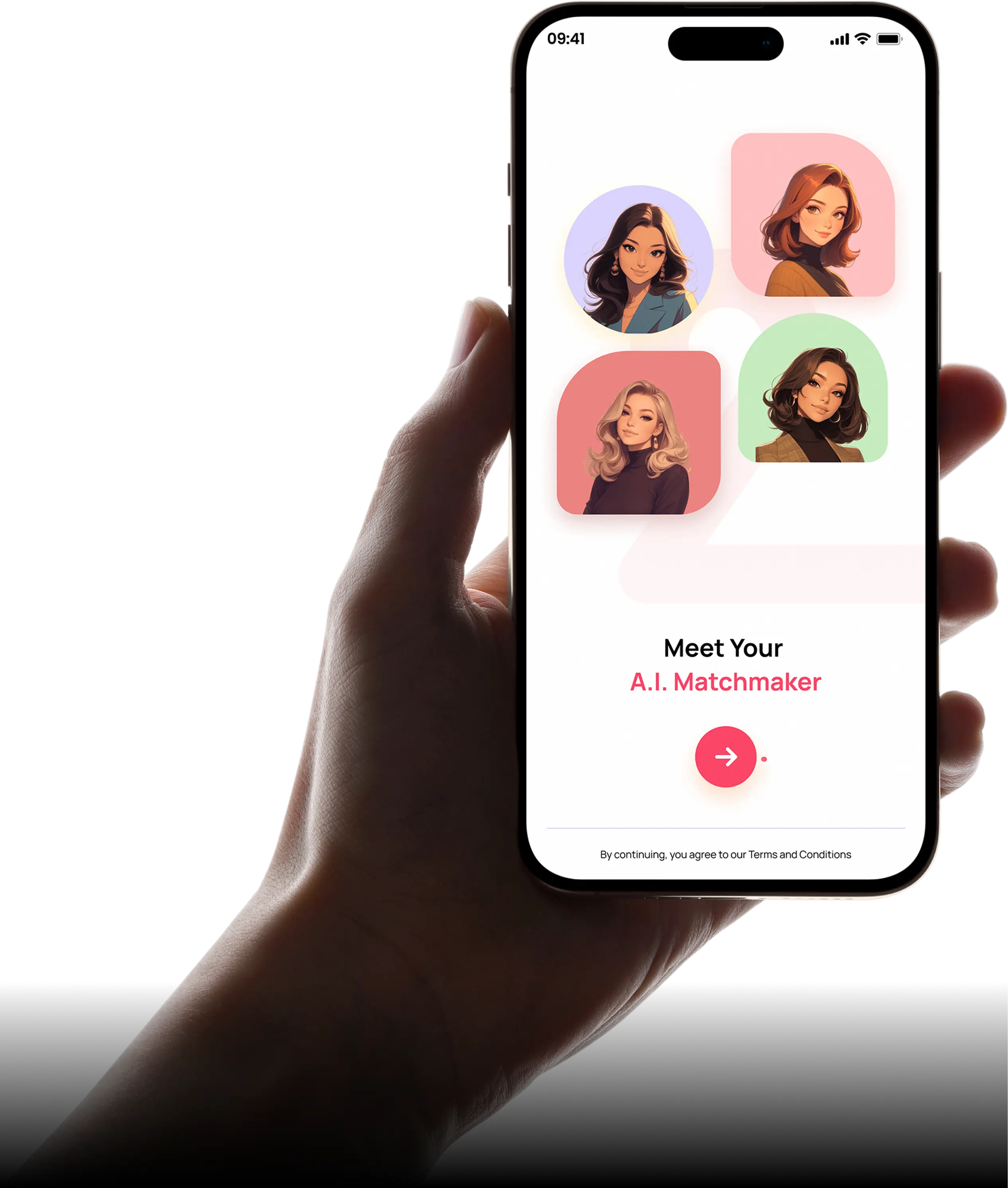
- 02The quiz is the first impression. So it had to be pleasant in itself: conversational questions, visible progress, no sense of an intake form.
- 03Fewer, better, explained. A short list of curated matches with reasoning reads as considered, where the same list without reasoning would read as a thin app.
The design work then concentrated on three things:
- 01A quiz paced so that the first questions are the easiest, since abandonment happens early or not at all.
- 02Match cards that lead with what you have in common rather than with a photograph.
- 03A calm, emotionally warm visual language, because this app asks for more patience than its competitors and has to feel worth it.
03What Actually Happened
The quiz was where most of the work went, and where I was most wrong.
My first version was thorough: the more it asked, the better the matching would be. In testing, people abandoned it partway and never came back, which produces no matching at all. Cutting it down and front-loading the easy, enjoyable questions got people through, and a completed short quiz beats an abandoned long one every time.
Compatibility presentation changed too. My first pass showed a compatibility score. It looked precise and it invited exactly the wrong behaviour, with people comparing strangers by percentage points. Replacing the number with two or three specific things in common was less impressive and considerably more persuasive.
After that it was pacing: how many matches to show at once, how long to leave between them, how quiet the app is allowed to be before quiet reads as broken.
04What Changed
Second Date launched on iOS and Android and was featured on the App Store, with the client reporting a 68% higher second-date rate, a 4.8 rating and more than 25,000 downloads in the first month.
What the design had to prove
- 01That people will finish a quiz if it is worth finishing.
- 02That a stated reason beats a compatibility score.
- 03That fewer matches can feel generous rather than empty.
The reason-on-the-card pattern is the piece I am most pleased with, because it is the whole proposition made visible in one component.
05What I Had to Work With
That last constraint is why so much of the work went into the reasoning component: it is the piece most easily lost in translation.
- 01Slower is a hard sell. Users arrive with habits from apps built on volume, so restraint had to be visibly deliberate or it reads as a lack of content.
- 02The cold start. Curated matching needs a pool, and the earliest users have the smallest one, so the experience had to hold up when there is little to show.
- 03Design-led scope. My part was research, UX, UI and prototype, so the prototype had to communicate intent precisely enough to survive being built by others.
06What I'd Do Differently
I would test the quiz length before designing the rest of the app. It is the gate everything else sits behind, and I designed the product around a quiz I had not yet proven people would finish.
I would also design the sparse state properly. A curated app with three matches is the reality of week one, and I designed for the version with plenty.
What I Learned
- 01A finished short form beats an abandoned long one. Every extra question improved the theory and reduced the data.
- 02Explain the mechanism. When the product's claim is better matching, hiding the reasoning throws away the only proof you have.
- 03Restraint has to look intentional. Fewer matches read as curation or as emptiness depending entirely on how they are presented.