A map-first social network for people whose workplace keeps moving.
- Industry
- Community
- Product
- Mobile App
- Platform
- App
- Year
- 2025
01The Real Problem
Lost & Found Crew is a social network for yacht crew. That sounds narrow until you understand the situation: your workplace moves, your colleagues rotate, your hours are long, and the people who understand your job are scattered across the world's marinas, occasionally in the same port as you, usually not.
General social apps do not solve this. They have no way to know you are crew, no way to prioritise who is physically nearby this week, and no reason to. What crew actually need is a way to find out who else is in the same place right now, and to trust that they are real.
So the design questions were:
- 01How do you make an app about here-and-now for people whose here changes weekly?
- 02How do you verify membership without making joining feel like a job application?
- 03How does someone go from seeing a stranger nearby to actually meeting them?
That last one is the whole product. Seeing who is nearby is easy. Making the next step feel natural rather than forward is the hard part.
02Finding the Fix
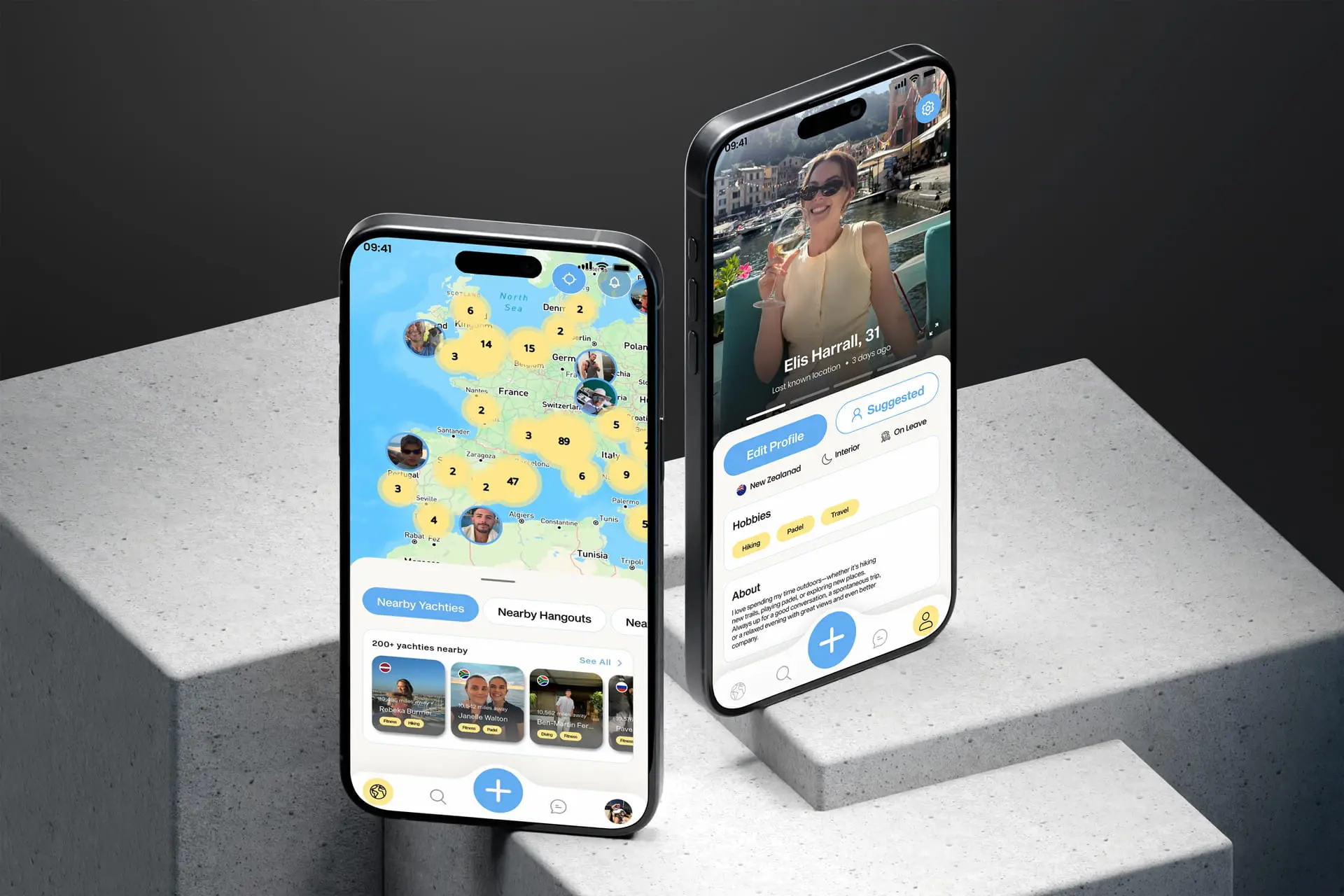
I designed the app around the map rather than a feed. A feed is about what happened; a map is about what is possible today, which is the question this audience is actually asking.
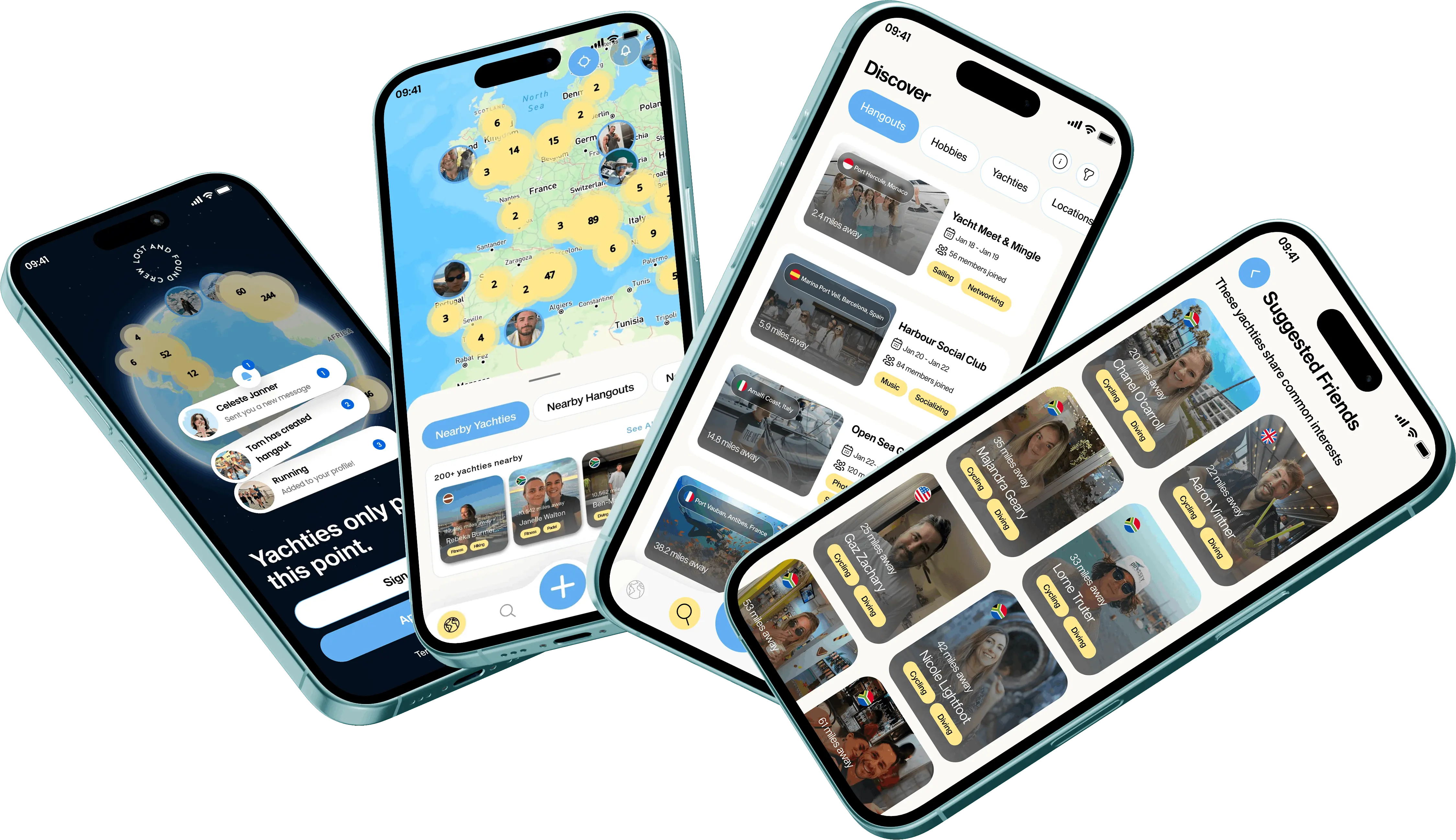
- 01The map is the home screen. Nearby crew and open hangouts appear together on it, so the app answers 'who is around' before you have to ask.
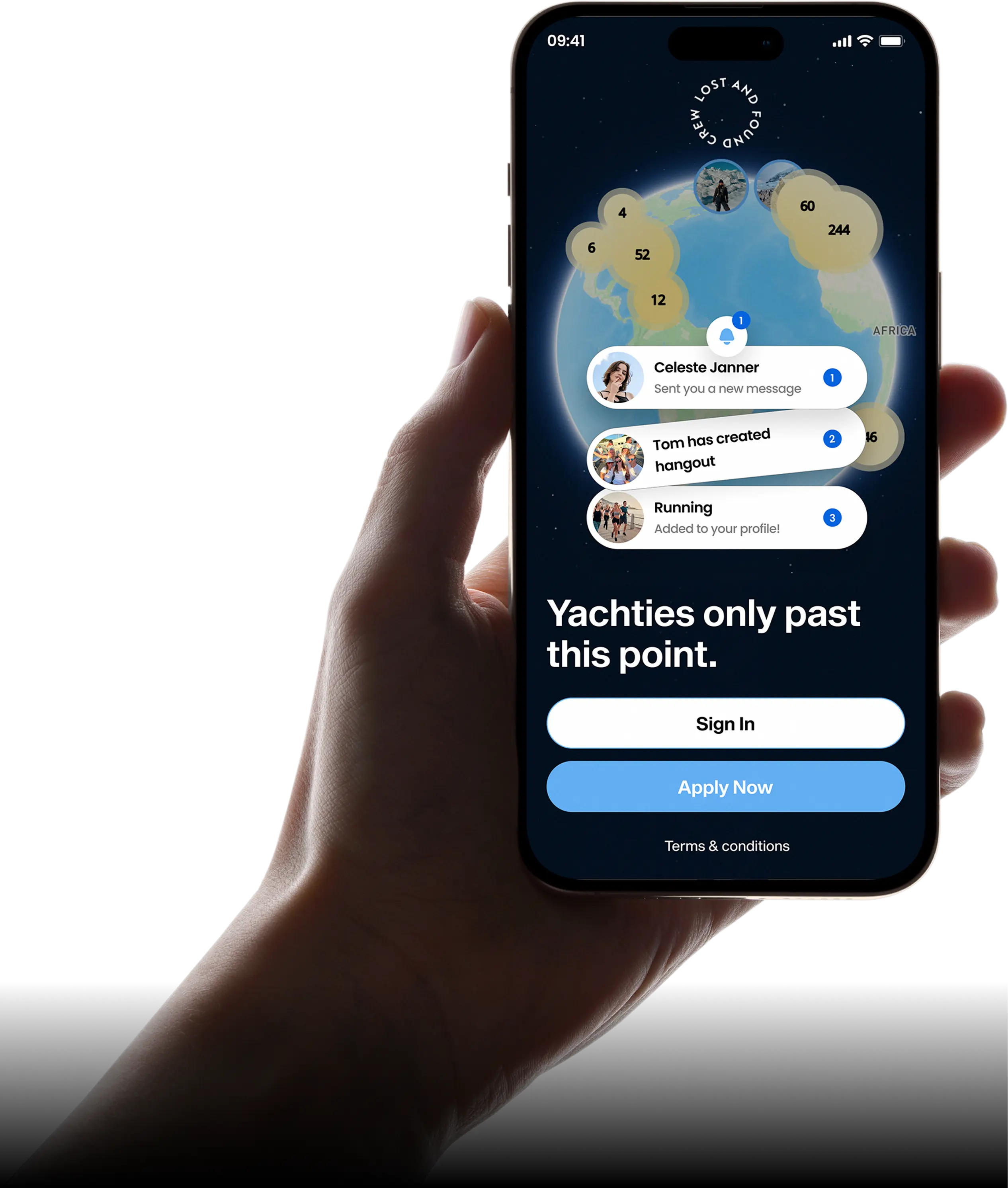
- 02Verification buys trust once. Admin-approved onboarding with CV verification keeps the network genuinely crew-only, so nobody has to be suspicious inside it.
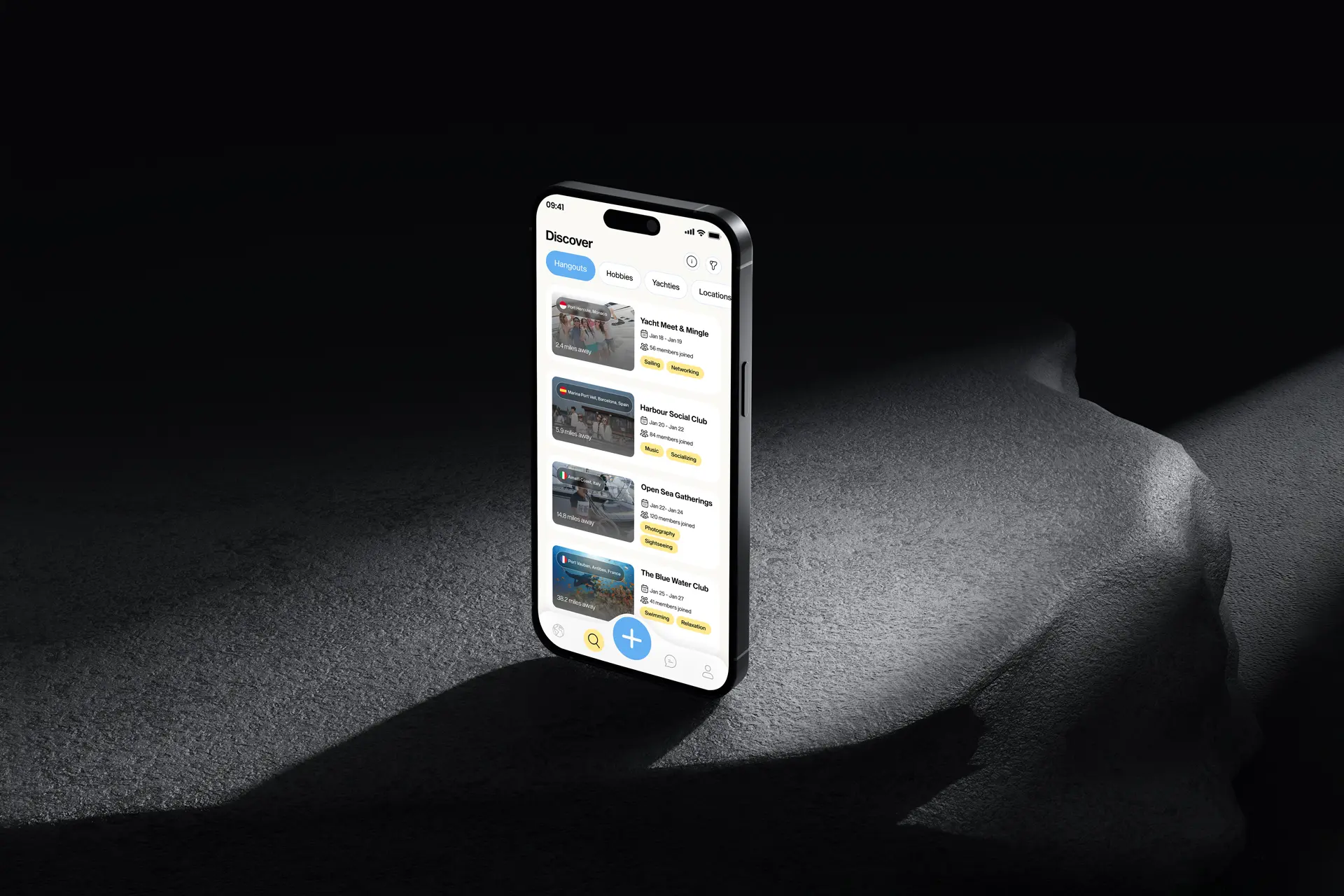
- 03Make the invitation the unit. A hangout is a public plan anyone verified can join, which is a far lower-stakes first move than messaging a stranger.
From there the work concentrated on three things:
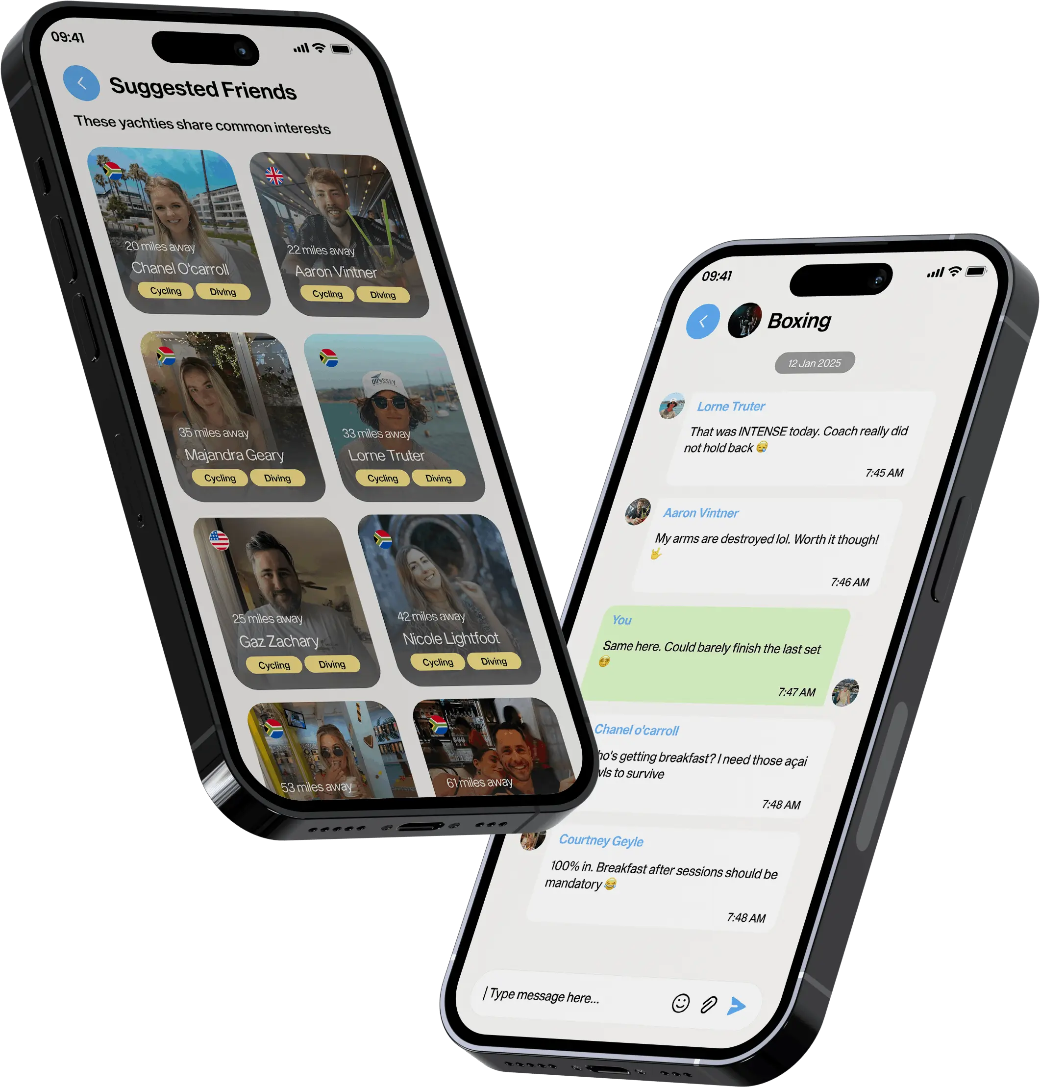
- 01Joining a hangout opening its group chat automatically, so plans have somewhere to be organised without anyone setting that up.
- 02Profiles built around what crew ask each other (role, vessel, where you have been) rather than a generic social bio.
- 03A map that stays readable when a marina is busy, which is the only time the app really matters.
03What Actually Happened
The correction I remember most was about proximity.
My first version showed people at their exact location on the map, which is what a map wants to do. Once I sketched a realistic marina it was obviously wrong: exact positions are both a safety problem and a social one, since being visibly precise makes people not want to appear at all. Showing an approximate area kept the usefulness and removed the exposure.
The onboarding also changed. My first pass explained the verification step carefully and at length, and it read as bureaucracy. Rewriting it as the reason the network is worth joining (everyone here is actually crew) turned the same delay into a selling point.
The rest was steady iteration with the founders, who know this world far better than I do, and who kept correcting my assumptions about how crew actually meet.
04What Changed
The app is live on iOS and Android, with a community in the thousands.
What the design had to do
- 01Answer 'who is around right now' in the first second.
- 02Make joining a plan easier than starting a conversation.
- 03Make verification feel like a benefit, not a barrier.
The hangout-plus-automatic-group-chat pattern is the piece I am most pleased with, because it removed the most awkward step in meeting someone new.
05What I Had to Work With
Those constraints are why approximate location, offline tolerance and verification carry so much of the design.
- 01A specific world I do not live in. I was designing for a profession with its own vocabulary and etiquette, so most of my early assumptions needed checking.
- 02Bad connectivity. At sea and in foreign ports the network is unreliable, so the app could not assume a live map at all times.
- 03Privacy against usefulness. Location is what makes this work and also what makes it risky, and every design decision sat on that line.
06What I'd Do Differently
I would design the empty state first. A location-based app is at its worst on day one in a quiet port, and that is exactly the moment most people form their opinion of it.
I would also spend time with crew directly rather than through the founders. They gave me excellent direction, but founders describe the world they are trying to build and users describe the one they are in.
What I Learned
- 01Precision is not always the goal. An approximate location was more useful than an exact one, because it made people willing to be on the map.
- 02Friction can be a feature if you explain it. The same verification step read as bureaucracy or as exclusivity depending entirely on the words around it.
- 03Design the smallest social step. Joining something public is far easier than messaging a person, and the product only works because that step exists.
