Interactive stories that teach children the words for how they feel.
- Industry
- Education
- Product
- Mobile App
- Platform
- App
- Year
- 2026
01The Real Problem
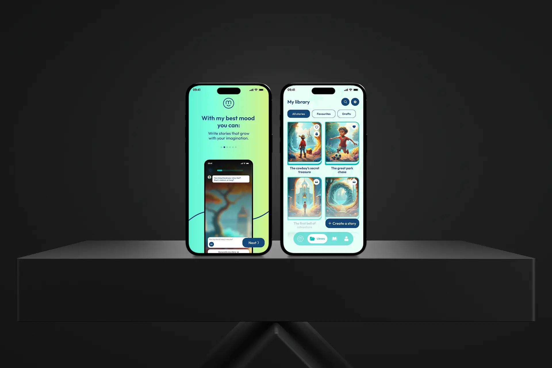
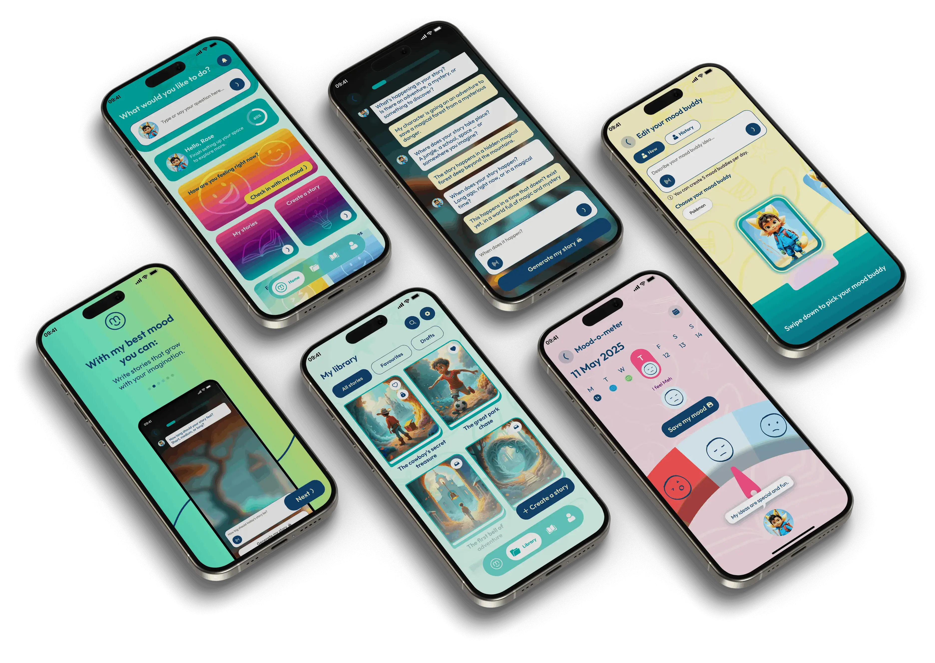
My Best Mood is an interactive storytelling app for children, where choices change the story and the stories are built to grow emotional vocabulary: the words for what you are feeling and what to do about it.
Children's apps have a specific failure mode. They look delightful and behave like television: the child watches, taps occasionally, and learns nothing they could not have learned lying down. Making a story genuinely interactive means every choice has to matter, which multiplies the content and complicates every screen.
There is also a second user nobody sees in the mockups. A parent decides whether this app stays on the phone, and they are judging different things: screen time, safety, and whether any of it is doing any good.
So the questions were:
- 01How does a child who cannot reliably read navigate a story?
- 02How do you make choices feel consequential without making them feel like tests?
- 03How does a parent get control without the app becoming a parent's app?

02Finding the Fix
I designed for a pre-reader first and let everything else follow from that.
- 01Pictures and voice carry the interface. Characters, colour and narration do the navigation, so text is a support rather than a requirement.
- 02Every choice changes something visible. A branch that only alters a line of narration is not felt; the character has to react, so the child can see that they caused it.
- 03Two doors, one app. Parental controls sit behind their own entrance with their own plainer visual language, so the child's app never turns into a settings screen.
The design work then concentrated on three things:
- 01Very large, very forgiving targets, because small hands tap approximately and a mis-tap in a story is a broken spell.
- 02A single reading path per screen, so there is never a question about what to do next.
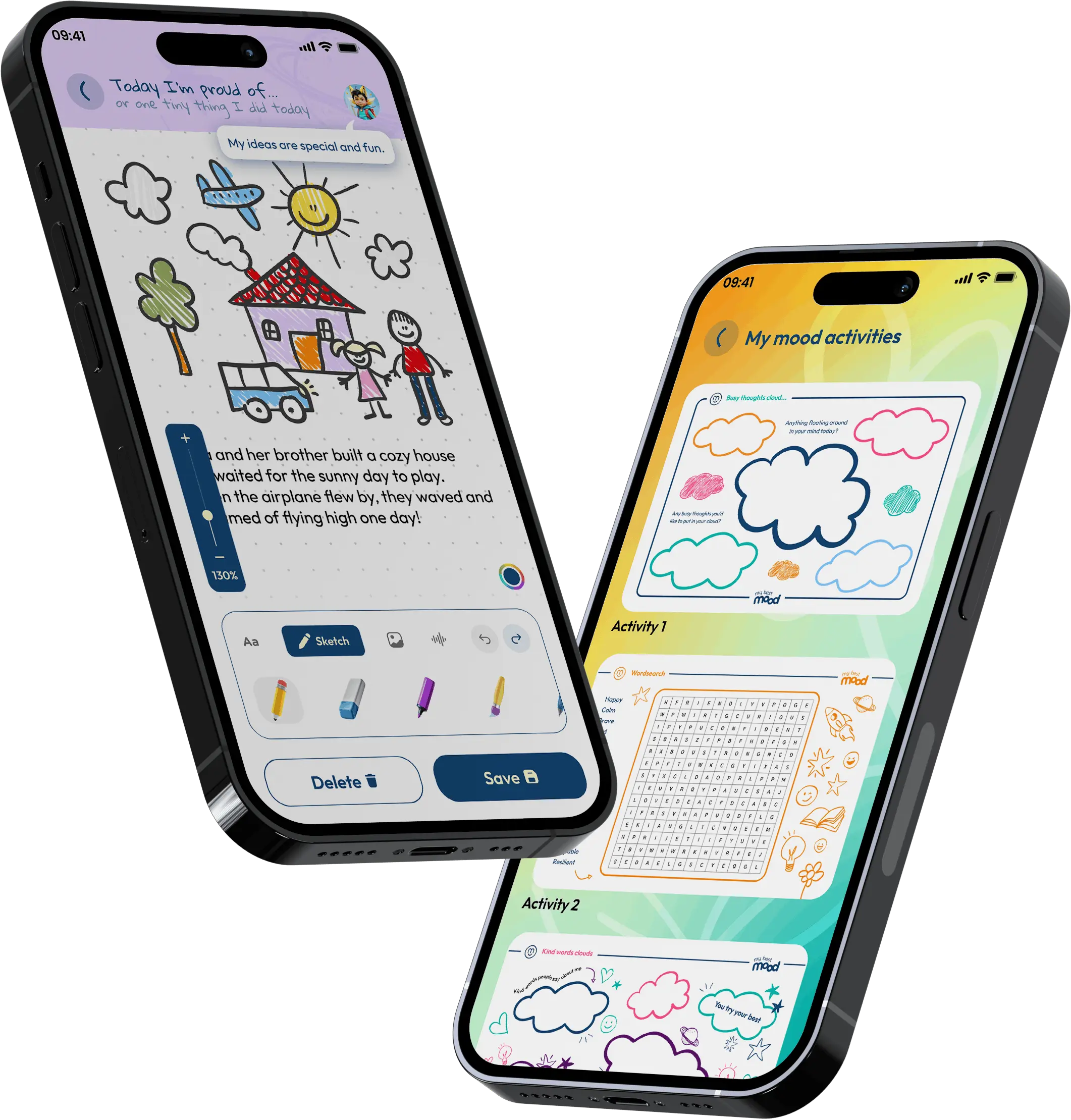
- 03Expressive character states (reactions, not decorations), which is where most of the emotional teaching actually happens.
The story framework itself came out of work with child psychologists and educators, so my job was to make sure the interface did not get in the way of it.
03What Actually Happened
Every feature was tested with children, which is the fastest and most humbling feedback loop I have worked in.
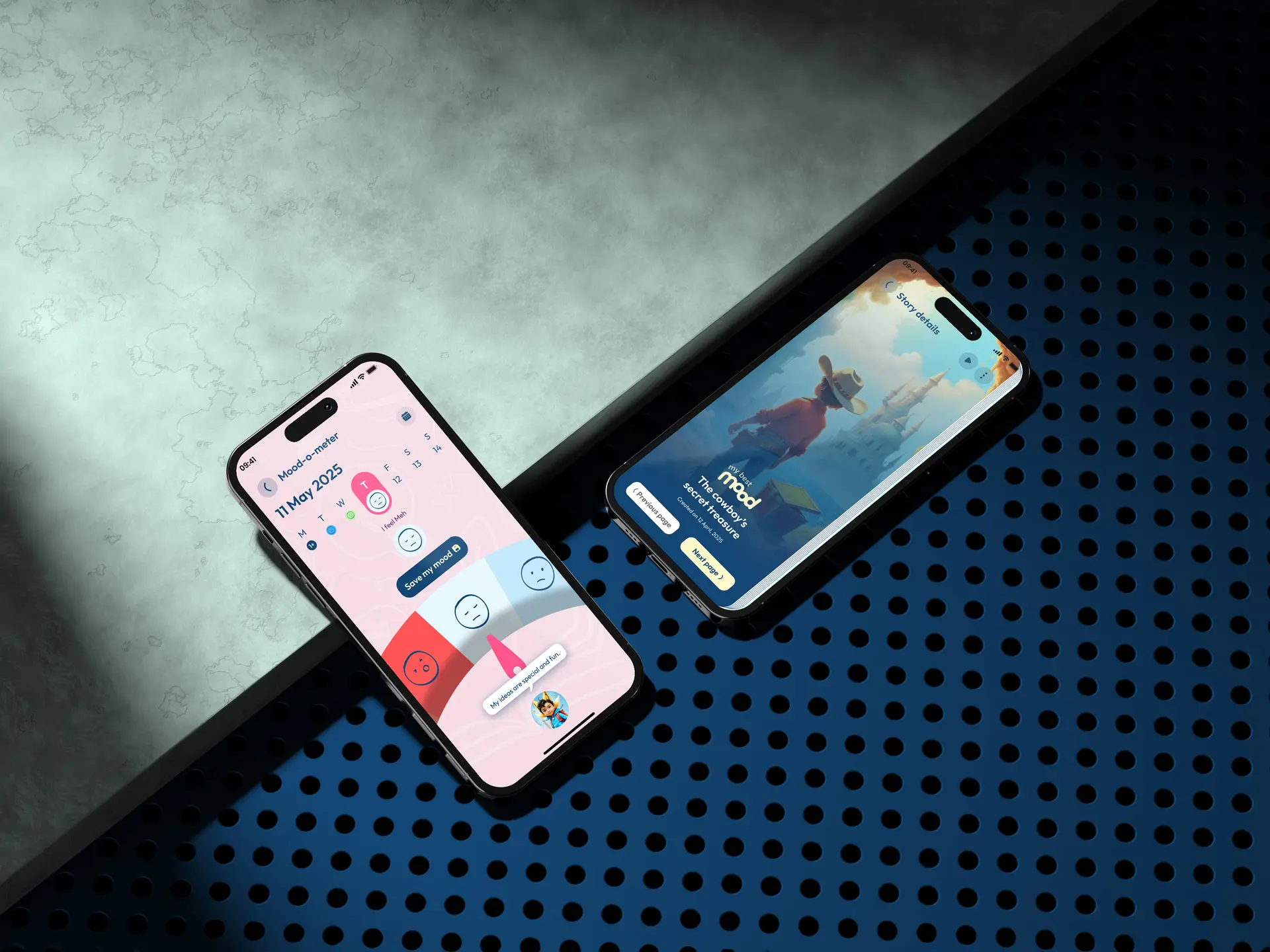
The choice moments were the clearest correction. My first version presented options as two neat cards, the way an adult interface would. Children hesitated, because two equal cards look like a question with a right answer. Turning the options into things happening in the scene, like a character to follow or a door to open, removed the hesitation completely. Same branching, no exam.
Progress went through a similar pass. I had a progress bar, which children ignored and parents liked. It moved into the parent area, where it is genuinely useful, and out of the story, where it was noise.
The rest was iteration on pacing: how long a scene holds before the child gets restless, and how quickly a character should react to a tap so the connection is obvious.
04What Changed
The app shipped on iOS and Android and was recognised with an App Store Editor's Choice award.
What the design had to achieve
- 01Usable by a child who cannot read a word of it.
- 02Choices that feel like play rather than assessment.
- 03Enough parental control to earn a place on the phone.
The in-scene choice pattern is the piece I am most pleased with, because it fixed engagement and comprehension with the same change.
05What I Had to Work With
Those limits are why the app is small in structure and rich in reaction, rather than the other way round.
- 01Users who cannot tell you what is wrong. A child does not explain confusion, they just stop. You have to read behaviour instead of feedback.
- 02Branching multiplies everything. Every additional choice multiplies the art, the audio and the states, so restraint in the design was a production requirement.
- 03Two audiences with opposite needs. The child wants immersion, the parent wants oversight, and putting them on the same screen fails both.
06What I'd Do Differently
I would test with children in week one instead of after the first designs existed. Every genuinely useful insight in this project came from watching a child use something, and I got that feedback later than I should have.
I would also design the audio at the same time as the screens. In a pre-reader product narration is not an asset that gets added later, it is half the interface, and treating it as a later step cost us a round of retiming.
What I Learned
- 01Presentation changes meaning. The same two choices read as a test in cards and as play in the scene.
- 02Design for whoever is watching too. The parent never uses the story and still decides whether the app survives the week.
- 03Children are unforgiving usability testers. They will not try to work out what you meant, which makes them the most honest signal you can get.