Turning a founder's vision into something usable.
- Industry
- SaaS
- Product
- Product Design
- Platform
- App
- Year
- 2024-25
01The Real Problem
Loom is sustainable fashion technology. The premise was simple to say and hard to build: connect people with vetted designers who upcycle and revive what is already in the wardrobe (a wedding dress, an heirloom, a jacket that no longer fits) instead of buying new.
The hard part is that nobody arrives knowing what they want. They arrive with a garment and a vague hope. Ask them to pick a service from a list and they stall, because they cannot tell if the answer is a re-dye, a resize or a redesign. Only a designer can.
So the questions I had to design around were:
- 01How do you take a request from someone who cannot name what they need?
- 02How do you match a garment to the right designer?
- 03How do you earn enough trust that someone posts an irreplaceable garment?
None of those are solved by a prettier form. They are solved by changing what the product asks for first.
02Finding the Fix
I mapped the journey from the garment rather than from a service menu, and three principles came out of it:
Start with the garment. A photo and a sentence about what you want, before any category is chosen.
Show the designer. Bespoke work cannot carry a fixed price tag, so the flow is built to end in a conversation, not a checkout.
Show the craft, constantly. Finished work is the argument for trusting the service, so it appears throughout rather than in a separate gallery.
Leading with the garment fixed the stall. People can always describe the thing in front of them, even when they cannot name the craft that would revive it.
The design work then concentrated on three things:
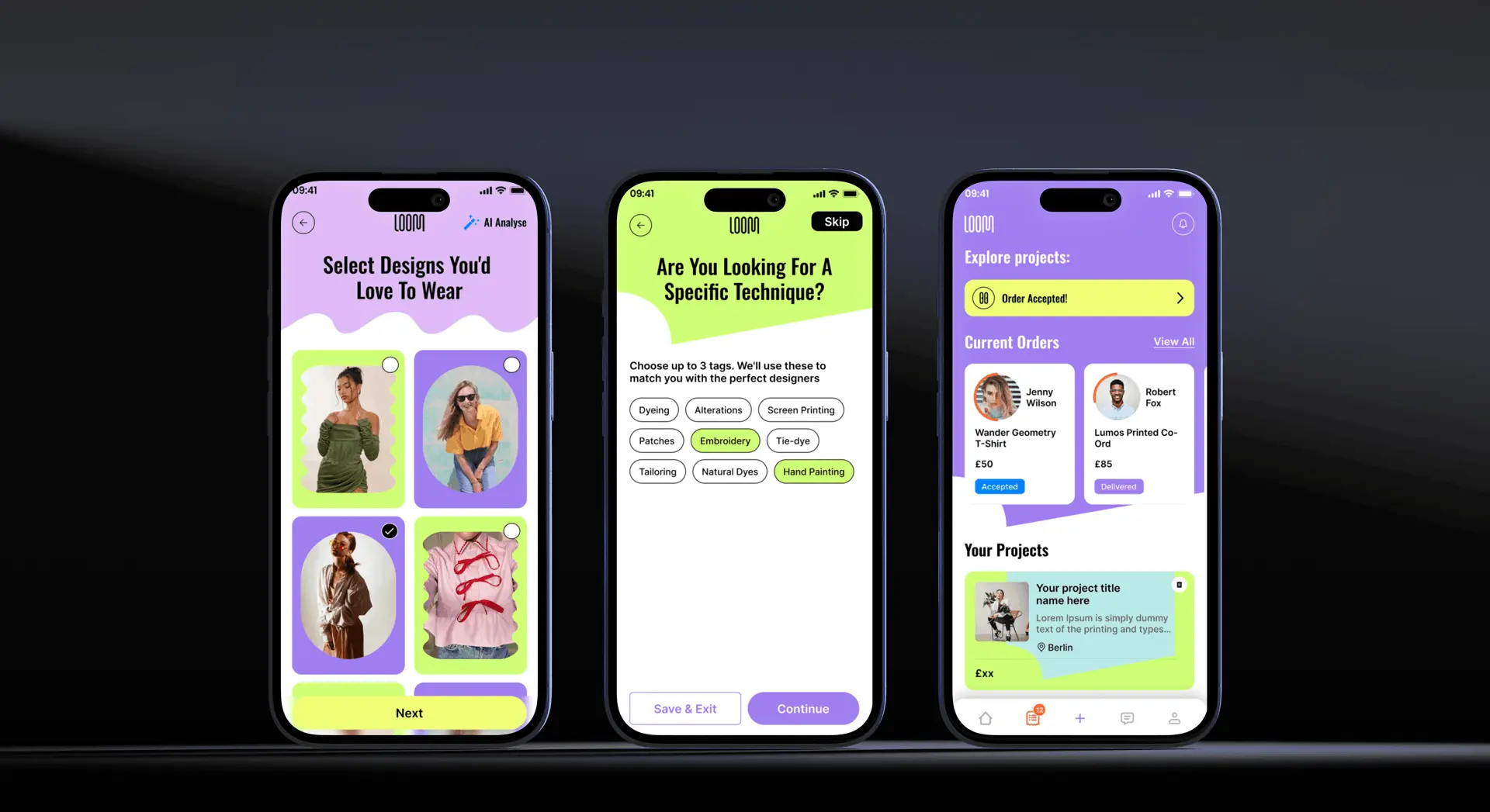
- 01An enquiry flow short enough to finish in one sitting, built around images and a plain description rather than a long specification form.
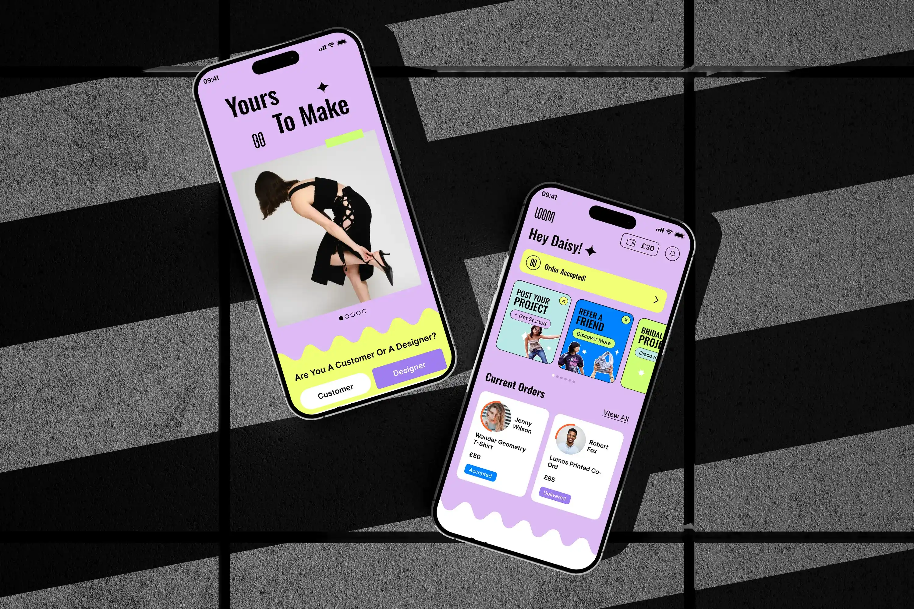
- 02A visual language that reads as a studio rather than a marketplace, because the service is craft and the interface had to look like it knows that.
- 03Before-and-after as a first-class component, reused across the site so the proof of the work is never more than a scroll away.
All designed in Figma and handed to the development team screen by screen.
03What Actually Happened
This was a founder-led project, so most of the process was working directly with her: sketch, review, cut, redraw.
My first enquiry flow was too thorough. It asked for fabric, measurements, timeline and budget before anything else, which is exactly the information a customer does not have yet. I cut it back to a photo, a short description and a way to reach them, and moved the rest into the follow-up conversation.
The service pages went the other way. My first pass treated each service as a card in a grid, which flattened them into commodities. Giving each one room, with its own imagery and explanation, made the difference between a menu and a studio.
Because the founder was not from a technical background, a large part of my job was translation: turning a description of a feeling into screens she could react to, and turning her reactions into something a developer could build.
04What Changed
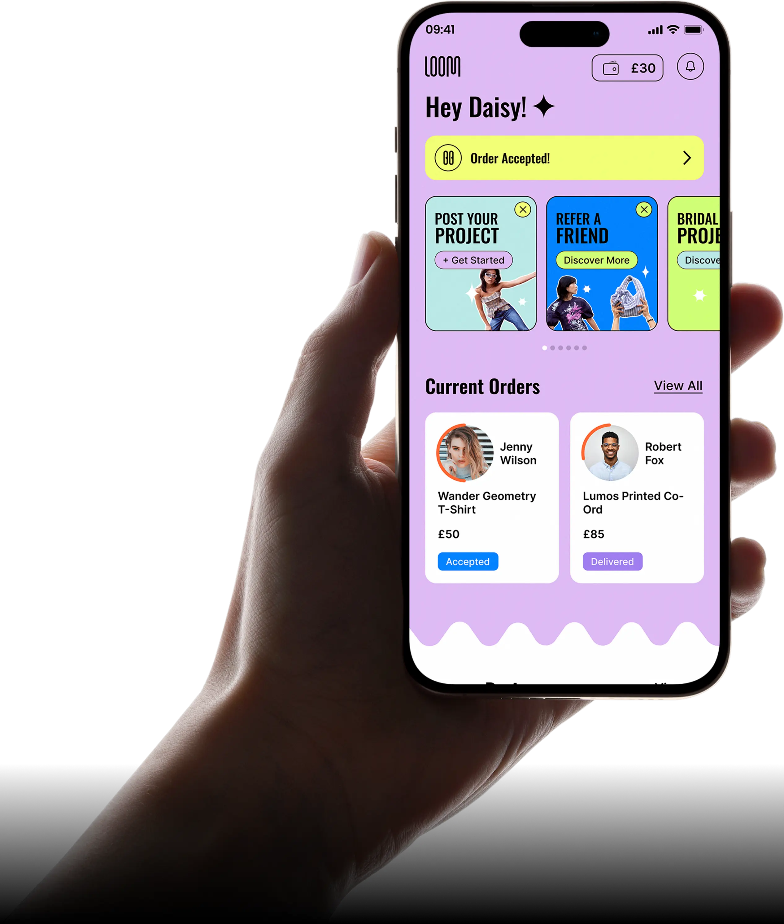
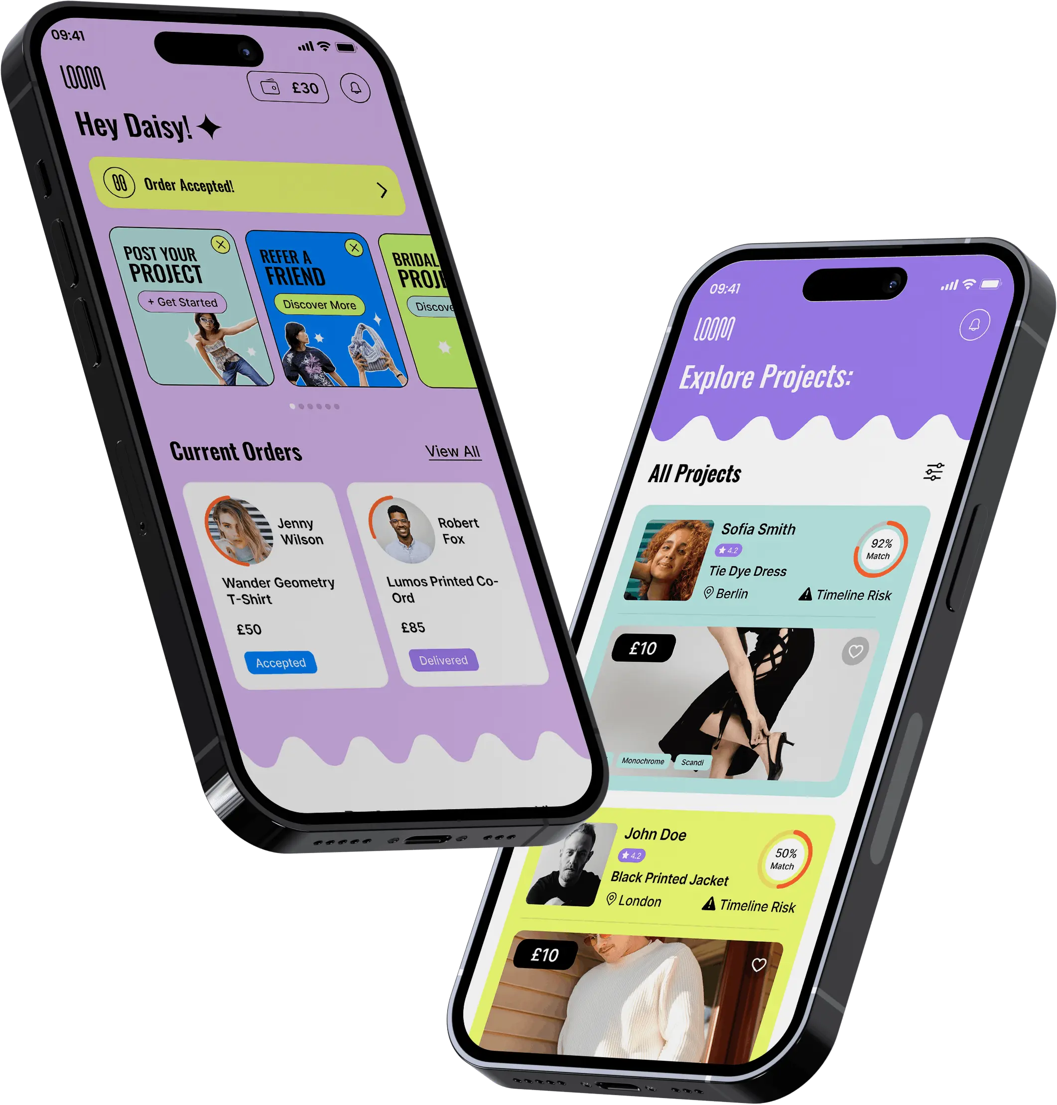
Loom shipped and has kept evolving since, through a rebrand. The structure I am most pleased with is the request flow, because it is the piece that made a one-off bespoke service explainable to someone arriving cold.
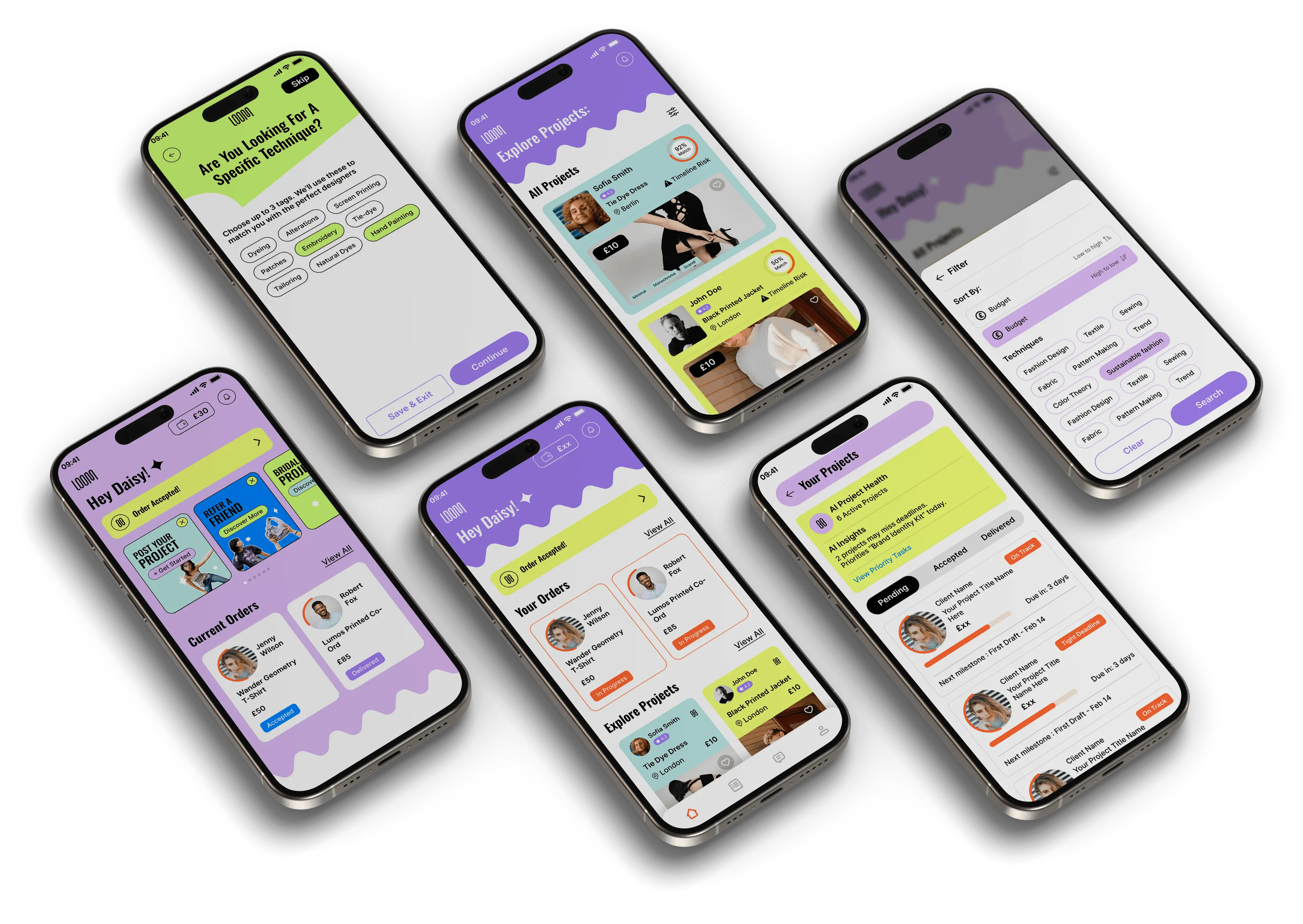
What the design had to prove
- 01That one photo was enough to start a real conversation.
- 02That the makers read as people, not results.
- 03That handing something irreplaceable over felt safe.
Every screen had to serve at least one of those before it earned its place.
05What I Had to Work With
Those limits pushed the product toward fewer, better screens rather than a broad feature set, which suited the service anyway.
A vision, not a brief. There was no existing product to study and no analytics to read. Direction came from the founder's knowledge of the craft, which meant a lot of drawing to find out what we actually agreed on.
Every job is different. Bespoke work resists the templates e-commerce relies on. Fixed prices, standard variants and instant checkout all had to be designed around rather than reused.
A small team. Design, brand and handoff sat with me, so anything I drew had to be something the team could realistically build and maintain.
06What I'd Do Differently
I would put a rough prototype in front of real customers earlier. We validated a lot with the founder, who knows the craft deeply, but a founder is not a first-time visitor and cannot see the product the way one does.
I would also agree the photography direction before designing the layouts. So much of this product is imagery, and designing around placeholder photos meant revisiting spacing once the real shots arrived.
07What I Learned
Ask for less. Cutting the request down to a photo and a sentence was the single change that made the product usable. Every field I removed was a reason to stay.
Working with a non-technical founder is a design skill in itself. Half the value I added was giving her something concrete to react to, because opinions about a drawing are far more useful than opinions about a description.
Trust is built with evidence. For a service handling irreplaceable things, showing finished work and naming the maker did more than any reassurance in the copy.
Loom launched at theloomapp.com and now trades as Studio Phini.