Making investing feel like a habit rather than an exam.
- Industry
- FinTech
- Product
- Mobile App
- Platform
- App
- Year
- 2025
01The Real Problem
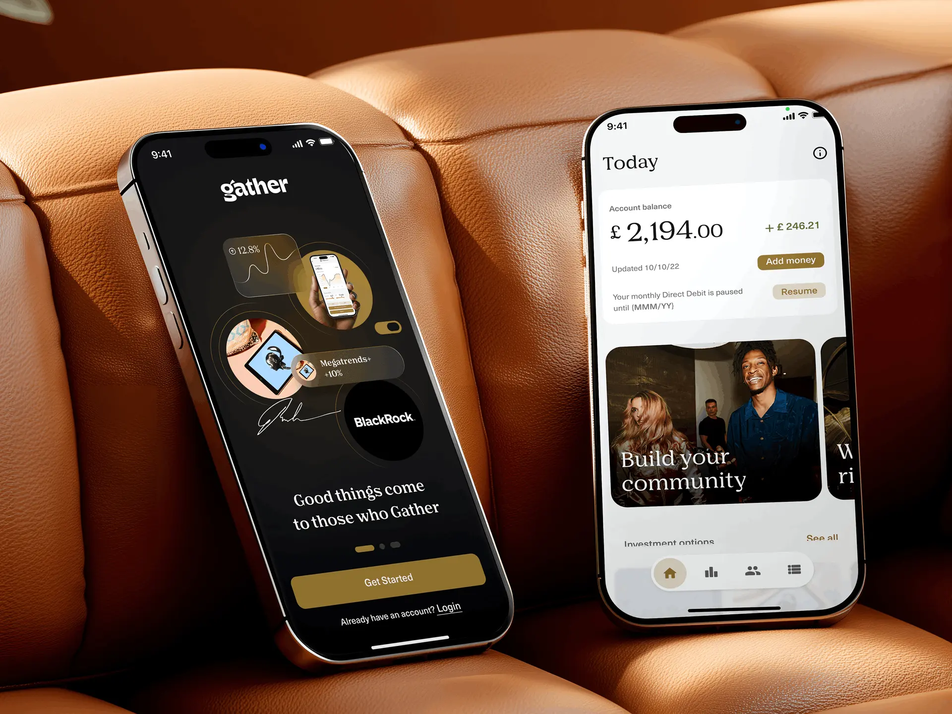
Gather is an FCA-regulated, multi-currency investment app that treats investing as part of a life rather than a separate financial chore. Alongside portfolios it carries learning, community and events, which is unusual, and which is exactly where the design problem starts.
Investment platforms are built by people who already understand investing. They open on a dashboard of figures and assume you can read it. For a first-time investor that screen is a wall: not difficult exactly, but intimidating enough that the honest response is to close the app and decide to deal with it later.
So the questions I was designing against were:
- 01How do you make a first investment feel like a decision someone can actually make?
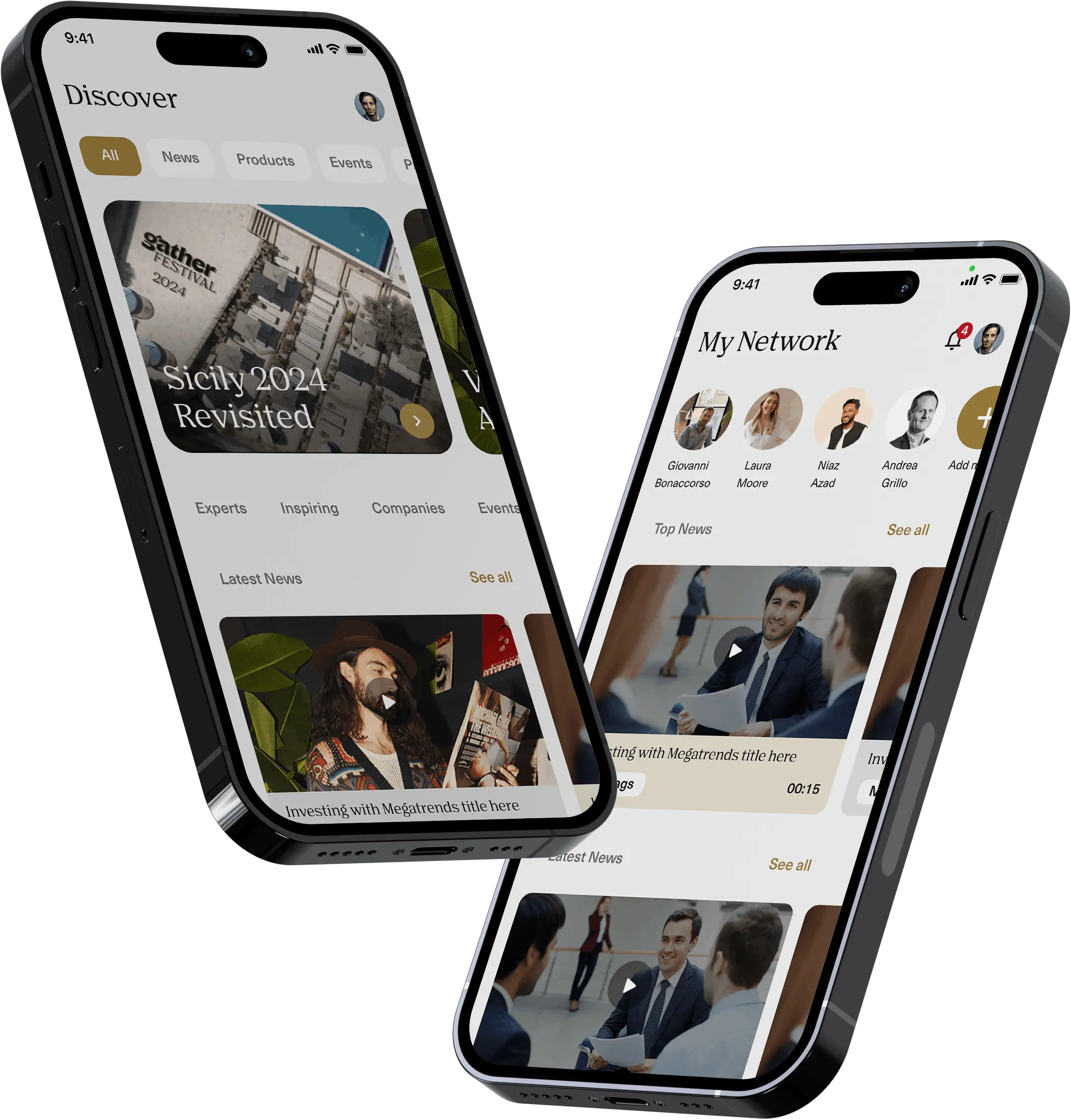
- 02How do wellbeing, learning and community sit next to money without looking like filler?
- 03How much can a regulated product simplify before it stops being accurate?
That last one shapes everything. In a regulated product you cannot hide the detail, so the work is sequencing it: deciding what someone needs at the moment of choosing, and what belongs one layer down.
02Finding the Fix
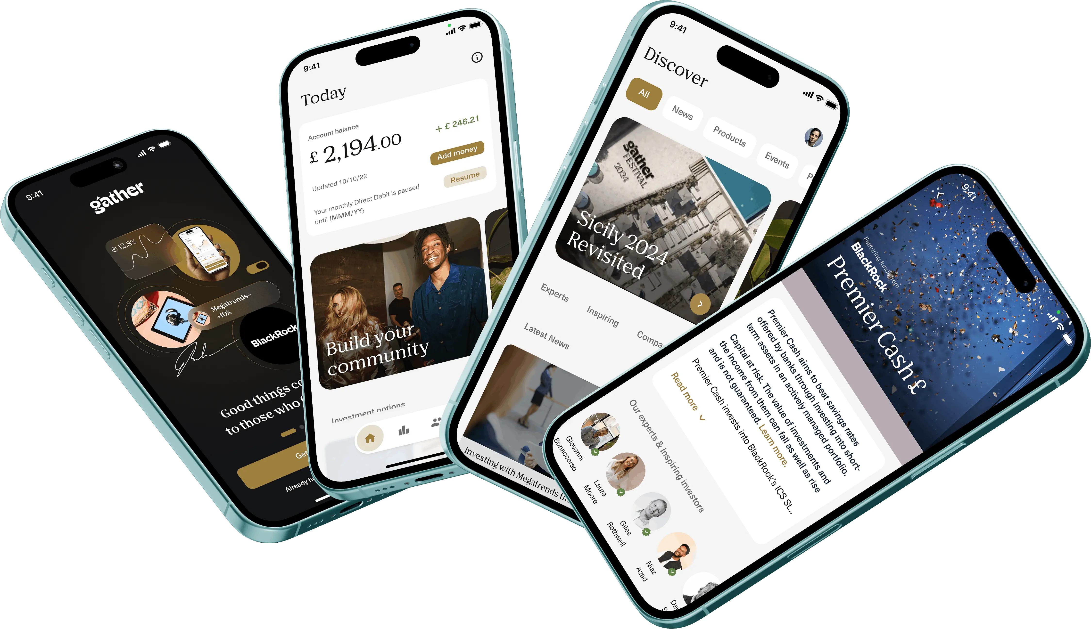
The unlock was a metaphor. Instead of asking people to assemble a portfolio, Gather presents curated portfolios as playlists and albums, a structure almost everyone already understands from music.
Three principles followed from that:
- 01Borrow a model people already have. A playlist implies a theme, a curator and a thing you can just press play on. It did more to explain a themed portfolio than a page of copy would have.
- 02Lower the first step, not the standard. A £30 minimum entry means the first decision is small enough to make, so the app can teach through doing rather than through onboarding screens.
- 03People are part of the product. Experts, copy investing and community are how a newcomer borrows confidence, so they belong in the main flow rather than in a separate tab.
The design work then concentrated on three things:
- 01An onboarding and funding flow that gets someone to a first, small investment without a finance vocabulary test on the way.
- 02A portfolio system where the theme, the curator and the risk are all readable at a glance, before any figures.
- 03A calm, modern interface that still reads as trustworthy, because a money app that looks playful loses the argument immediately.
03What Actually Happened
I worked through the product with the founder and product team, and the corrections were mostly about how much to show.
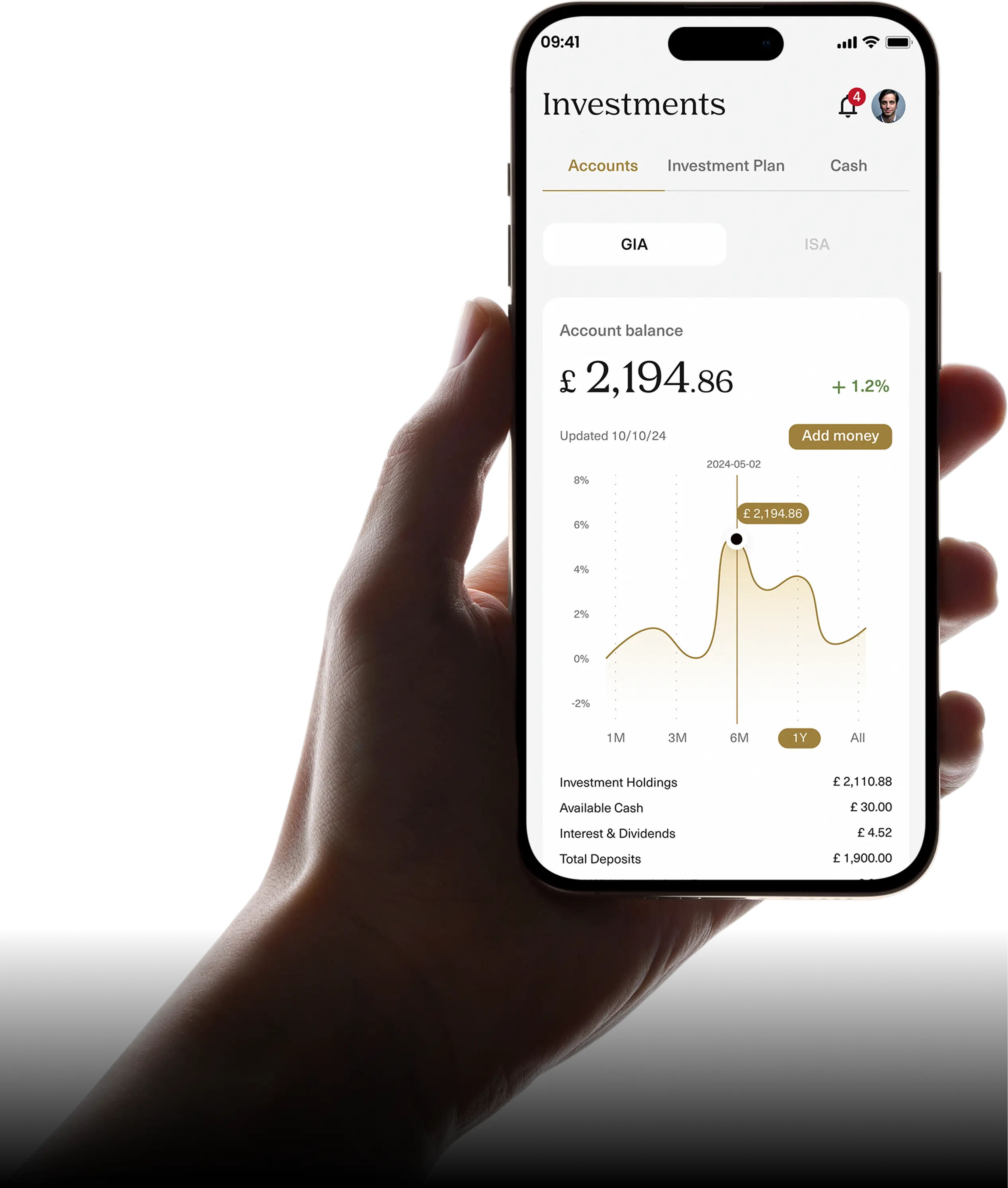
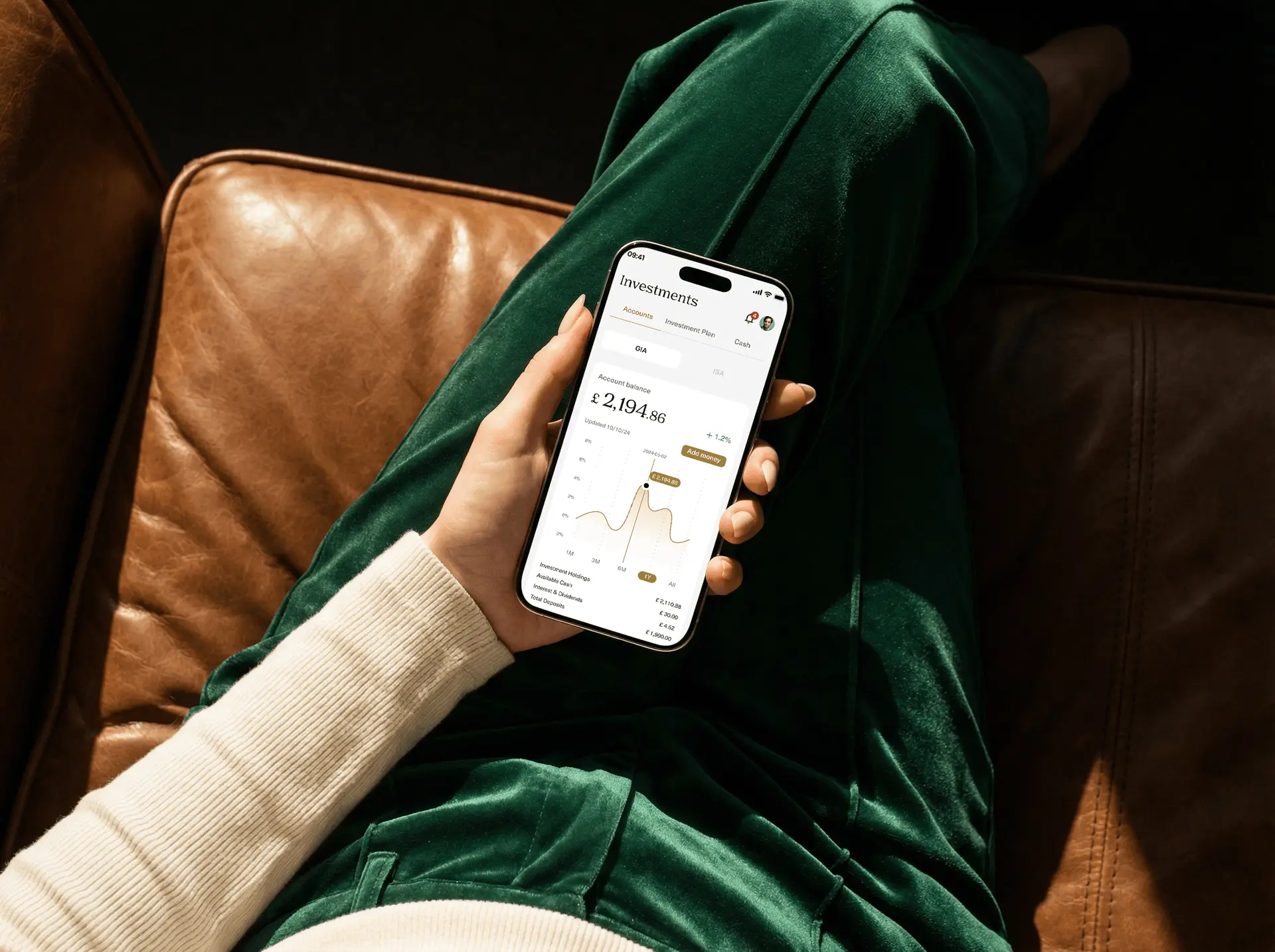
My first portfolio screen led with performance charts, which is what investment apps do. It made the playlist idea invisible: the moment you open with a graph, you are back to being a finance product. Leading with the theme and the curator, and putting performance a scroll below, made the metaphor hold.
Onboarding went the other way. My first version was too light: friendly, quick and quietly missing the risk information a regulated product must present. Working through the compliance requirements with the team turned that into a real constraint rather than a footnote, and the flow got better for it, because it forced me to decide what a first-time investor genuinely needs to read.
From there it ran as steady iteration: prototype the playlist and copy-investing flows, review, adjust, hand off screen by screen.
04What Changed
Gather shipped on the App Store and Google Play.
What the design set out to do
- 01Make a first investment small enough to actually make.
- 02Explain a portfolio without a glossary.
- 03Let learning and community carry confidence the interface cannot.
The piece I am most pleased with is the playlist model, because it turned the hardest screen in the product into the most obvious one.
05What I Had to Work With
Those limits are why the app leans on sequencing and metaphor rather than on stripping things out. There was nothing to strip.
- 01Regulation is not negotiable. Certain disclosures have to appear, in full, at specific points. The design could sequence them but never remove them.
- 02Two audiences, one app. Someone investing for the first time and someone who already runs a portfolio want opposite amounts of detail on the same screen.
- 03A product with three jobs. Investing, learning and community each have their own conventions, and any pattern I used had to survive all three or it created a seam.
06What I'd Do Differently
I would test the playlist language with people outside the team much earlier. It was obvious to us within a week, and obvious-to-the-team is the least reliable signal in design.
I would also map the compliance requirements before drawing the flows rather than alongside them. Retrofitting mandatory content into a finished flow is far more expensive than designing around it from the start.
What I Learned
- 01A borrowed mental model beats an explanation. Playlists did in one word what several screens of onboarding copy had failed to do.
- 02Constraints improve products when you meet them early. The regulatory requirements made the onboarding clearer once I stopped treating them as an obstacle.
- 03Confidence is a design material. Most of what stops a first-time investor is not comprehension, it is nerve. Experts, community and a small first step address that better than any layout.