Designing calm into a wellness app that people open on their worst days.
- Industry
- Healthcare
- Product
- Mobile App
- Platform
- App
- Year
- 2026
01The Real Problem
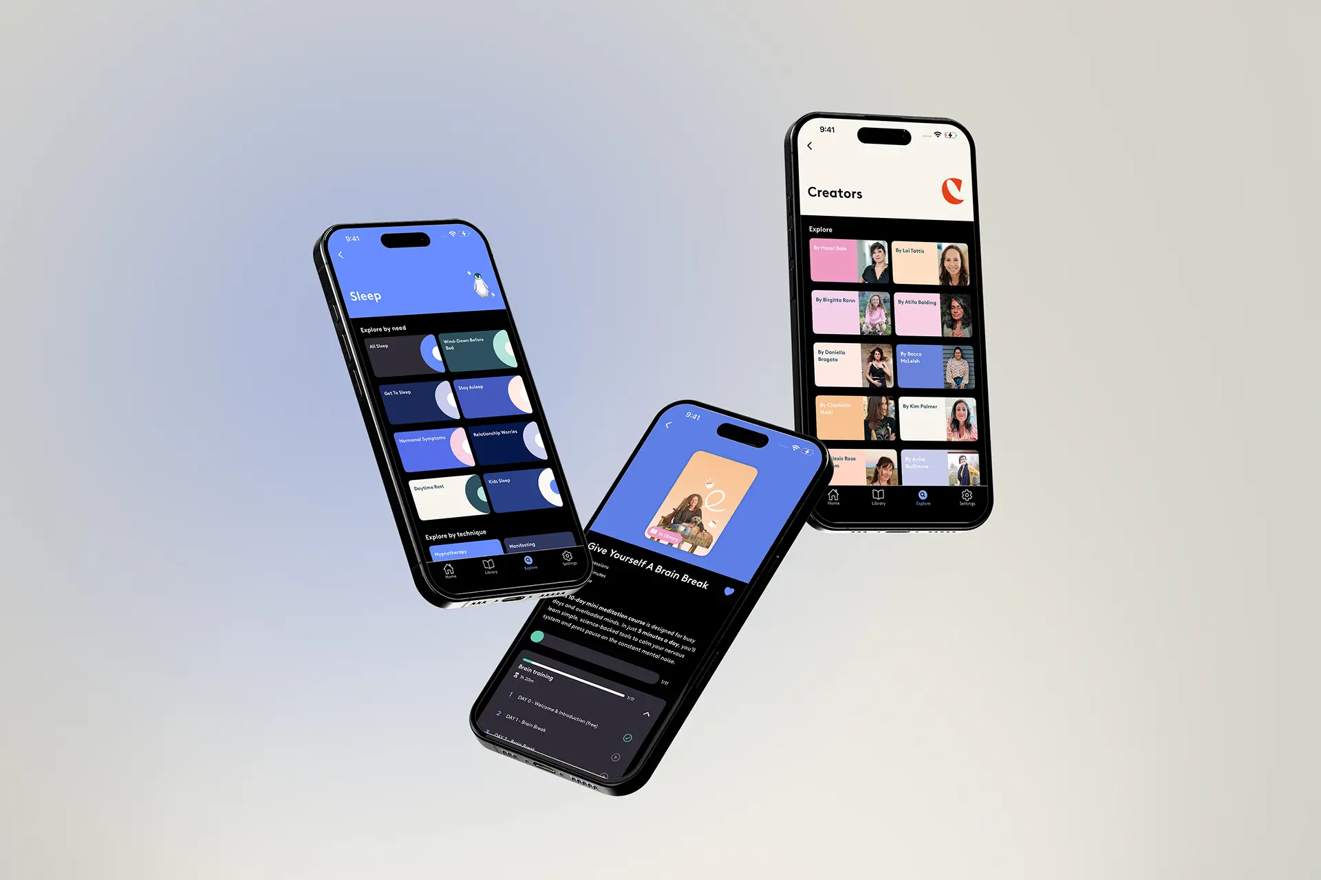
Clementine is an ORCHA-certified mental wellness platform: guided hypnotherapy and audio sessions, expert-led courses, personalised affirmations and daily habit building. It already had a large membership when I joined the work, which changes the job entirely.
Designing a wellness app from zero is a question of what to build. Designing for an established one is a question of what you are allowed to move. People have habits inside the product, and a habit is exactly what the app exists to create, so a redesign that improves a screen but breaks a routine has made things worse.
The real problem underneath is that wellness habits fail quietly. Busy lives, no guidance, resources scattered across half a dozen places. The app's job is to be the thing you still open on the day you have no energy for it.
So the questions were:
- 01How do you improve a product people already rely on without disturbing the reliance?
- 02How does one interface hold sessions, courses, affirmations and tracking without feeling like four apps?
- 03What does the app look like on someone's worst day, not their best?
02Finding the Fix
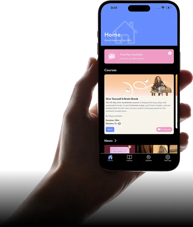
I treated the design system as the deliverable rather than any individual screen. With this many content types arriving continuously, consistency is the only thing that scales.
- 01One system, four content types. Sessions, courses, affirmations and tracking share the same components, so learning one part of the app teaches you the rest of it.
- 02Design for the low-energy day. Every core action is reachable in a tap or two from open, because the day someone most needs this is the day they have least patience for navigation.
- 03Calm is a requirement, not a style. Restrained colour, generous space and plain language, because visual noise reads as pressure in a product about lowering it.
From there the work concentrated on three things:
- 01A personalised home that surfaces the next thing rather than presenting a library to browse.
- 02Progress that encourages without scoring: streaks and history that recognise a return rather than punish a gap.
- 03Accessible defaults throughout: type sizes, contrast and targets that hold up for someone reading in bed at night.
03What Actually Happened
This is an ongoing partnership rather than a single project, so the work runs as a continuous cycle: design, ship, watch, adjust.
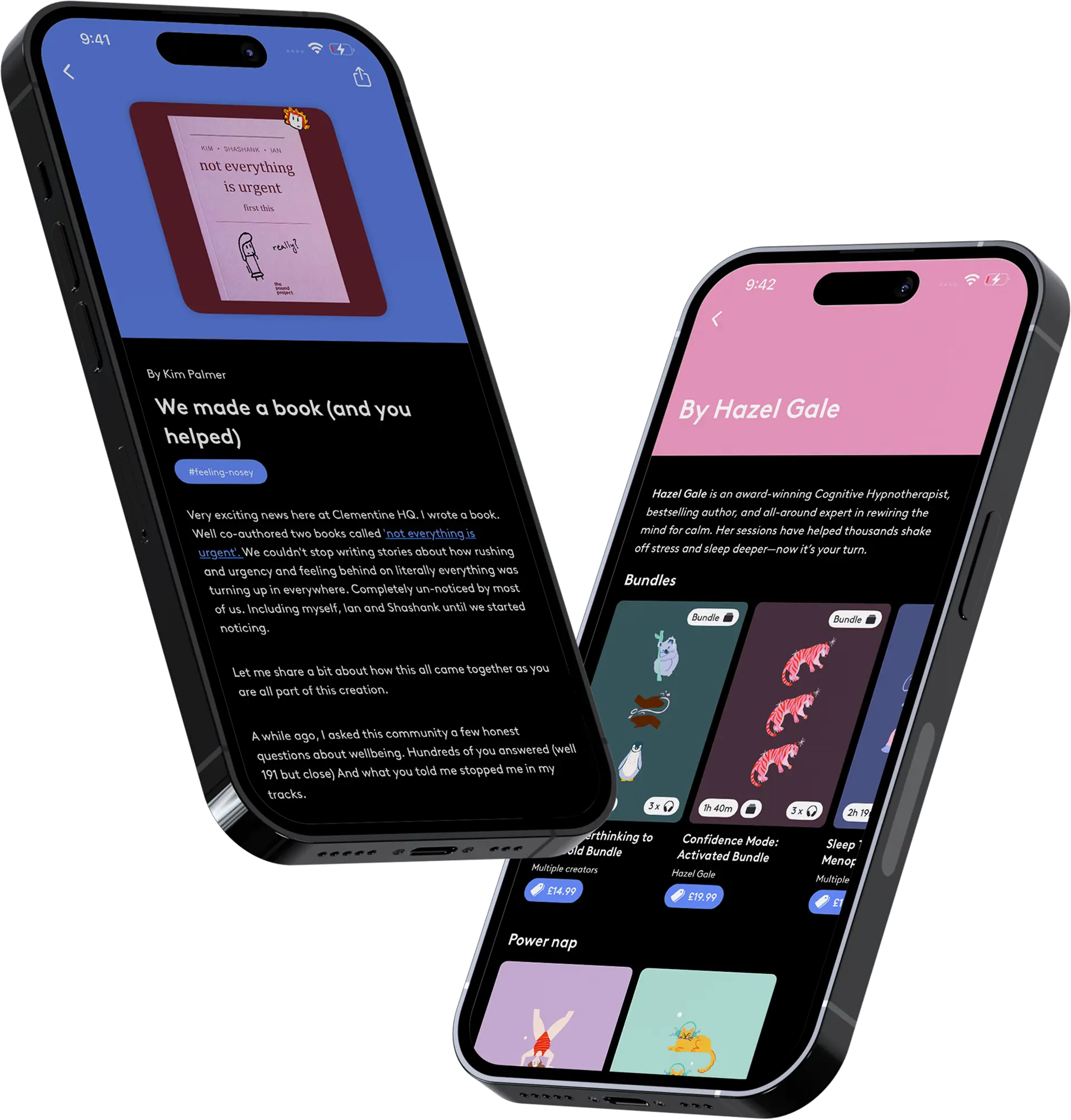
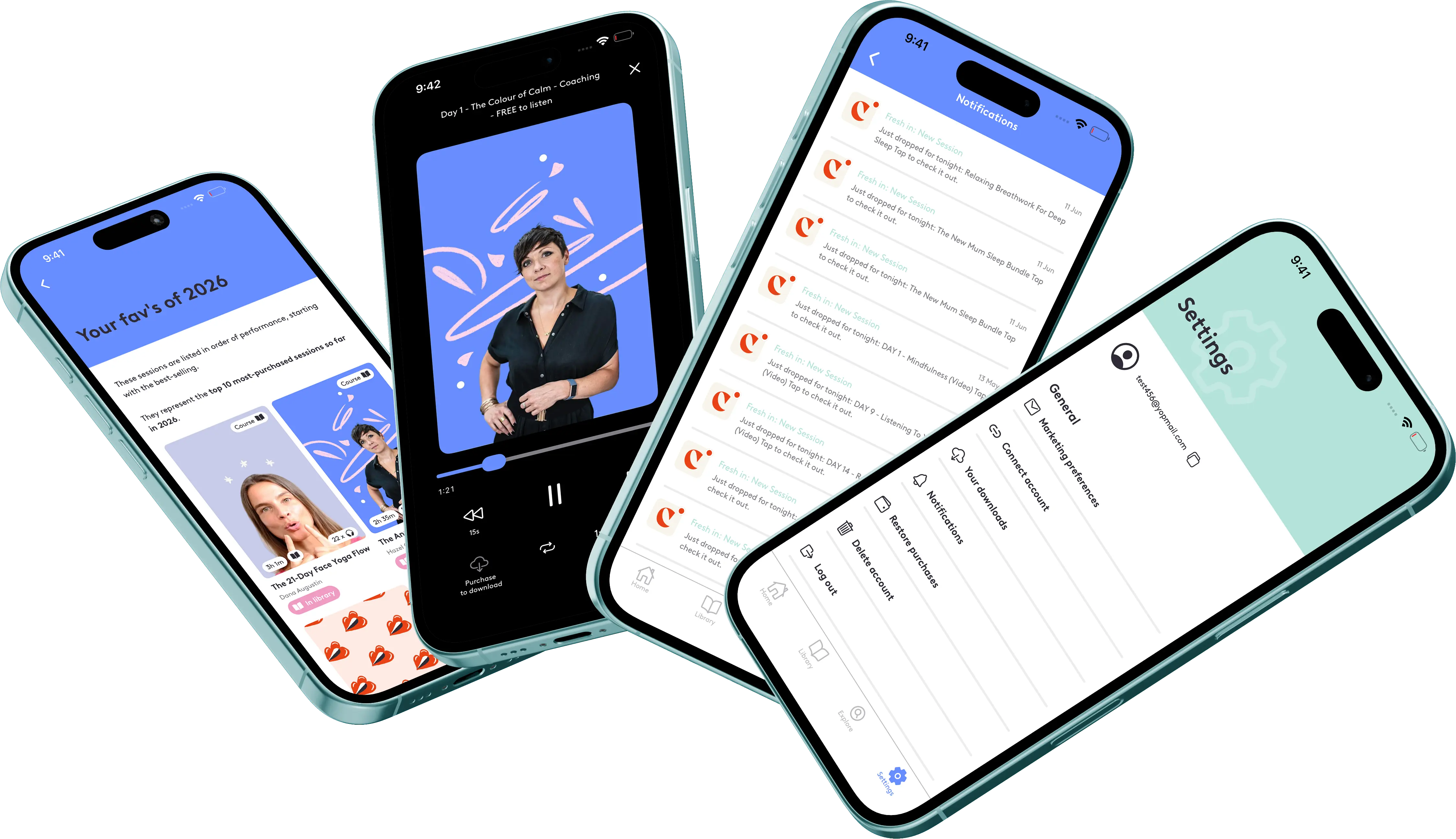
Progress tracking was the clearest correction. My first version was a straightforward streak counter, which is the standard habit-app pattern. In a mental wellness product it is actively wrong: a broken streak on a bad week tells someone who is already struggling that they have failed at recovering. I replaced it with history and gentle prompts that treat a return as the achievement, which is what it is.
The home screen went through several passes too. Personalisation kept pulling toward showing more: more recommendations, more categories, more of the catalogue. Each pass ended with me removing things, until the screen answered one question: what should I do now?
04What Changed
Clementine runs on iOS and Android, is certified safe by ORCHA and is trusted by a membership in the hundreds of thousands, with a 98% helpfulness rating and coverage in the WSJ, The Guardian and Forbes.
What the design had to hold
- 01Reachable in a tap on a day with no energy.
- 02Consistent enough that new content never needs new patterns.
- 03Encouraging without ever keeping score.
The part I am most pleased with is the tracking model, because it is the one place where the obvious pattern was the wrong one.
05What I Had to Work With
That third constraint is the reason the system matters more than any screen in this project.
- 01An established audience. Existing members have muscle memory. Every change had to justify the cost of relearning.
- 02A certification to keep. ORCHA certification sets a bar for safety and clarity, so wording and flows in sensitive areas were not free to be clever.
- 03Content that never stops arriving. New sessions, courses and programmes land continuously, so nothing could depend on a fixed catalogue size or a hand-placed layout.
06What I'd Do Differently
I would ask for the usage data before designing rather than after. On a product this size, what people actually open answers questions I spent time debating.
I would also build the accessibility checks into the component library from the start instead of auditing screens later. Fixing contrast and target sizes at the component level is one change; fixing them at the screen level is fifty.
What I Learned
- 01The standard pattern can be the wrong pattern. Streaks work in fitness apps and fail in mental wellness, and only the subject matter tells you that.
- 02On an established product, restraint is the skill. The best change is often the smallest one that removes a real obstacle.
- 03Systems outlive screens. Everything I designed here will be extended by someone else, so the components were the actual deliverable.