Using an AI interview to make dating profiles honest again.
- Industry
- Dating
- Product
- Mobile App
- Platform
- App
- Year
- 2025
01The Real Problem
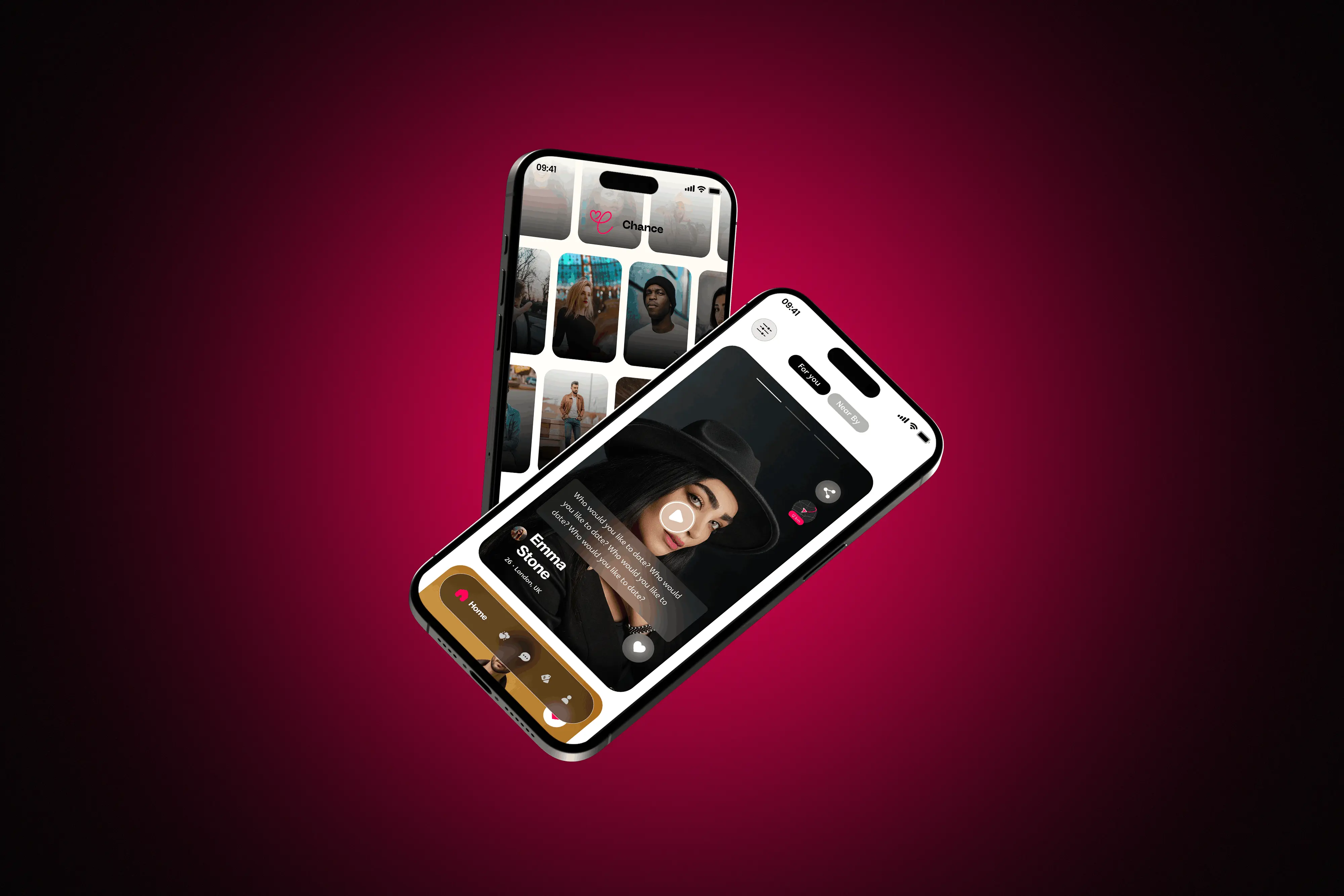
Chance is a dating app built on a simple bet: that people will be more honest on video than in a form, and that a short interview reveals more than a curated grid of photographs ever will.
The problems it set out to fix are the ones everyone complains about: fake profiles, matches with nothing behind them, and messages nobody asked for. What makes them hard is that the usual fixes make the app worse. Verification adds friction at signup, where drop-off is highest. Longer profiles get abandoned. Restricting messages reduces the activity the app is measured on.
So the design questions were awkward ones:
- 01How do you ask someone to record video before they trust the app at all?
- 02How do you make safety a feature people want rather than a barrier they tolerate?
- 03How do you show what an algorithm concluded without pretending it is certain?
02Finding the Fix
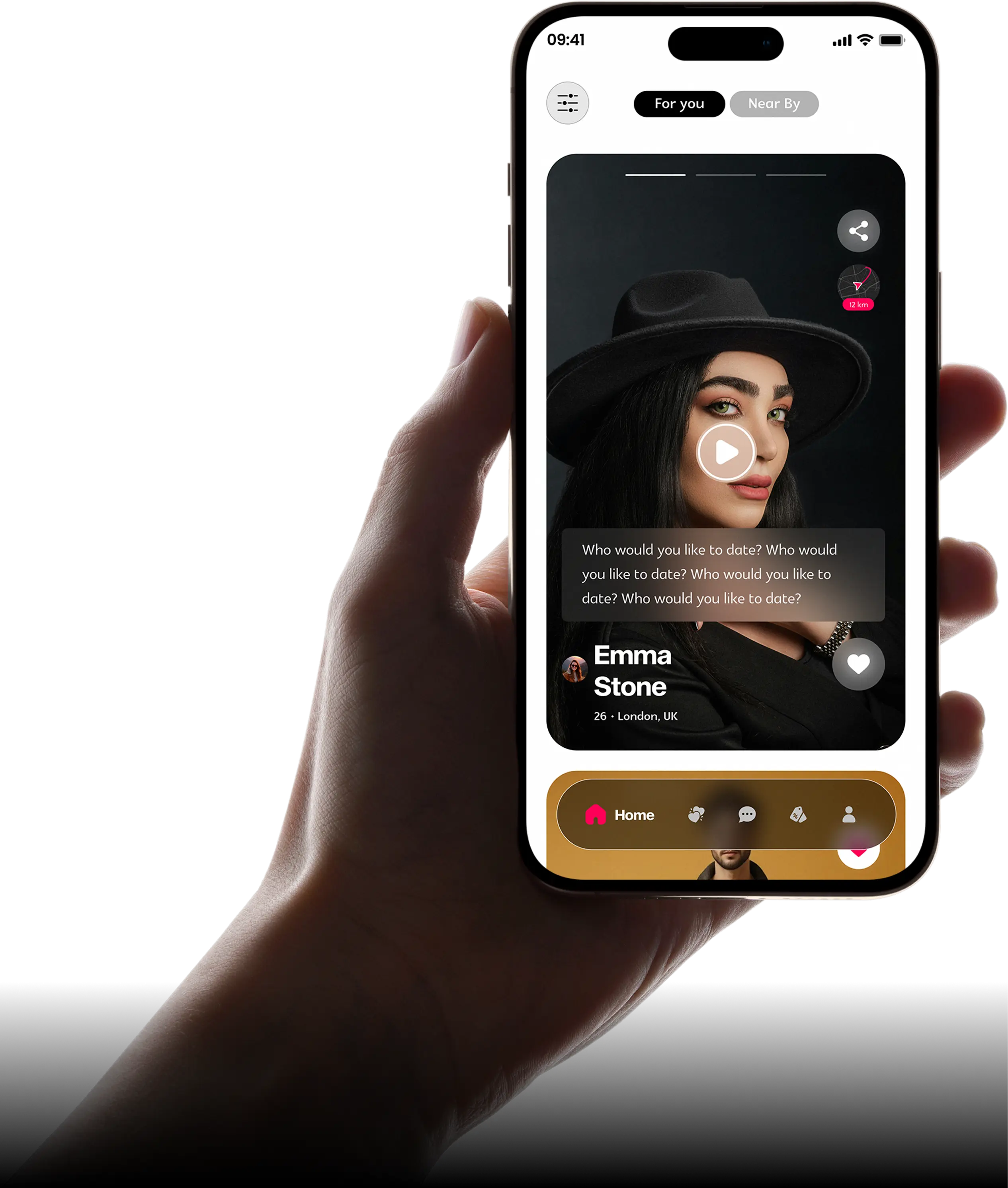
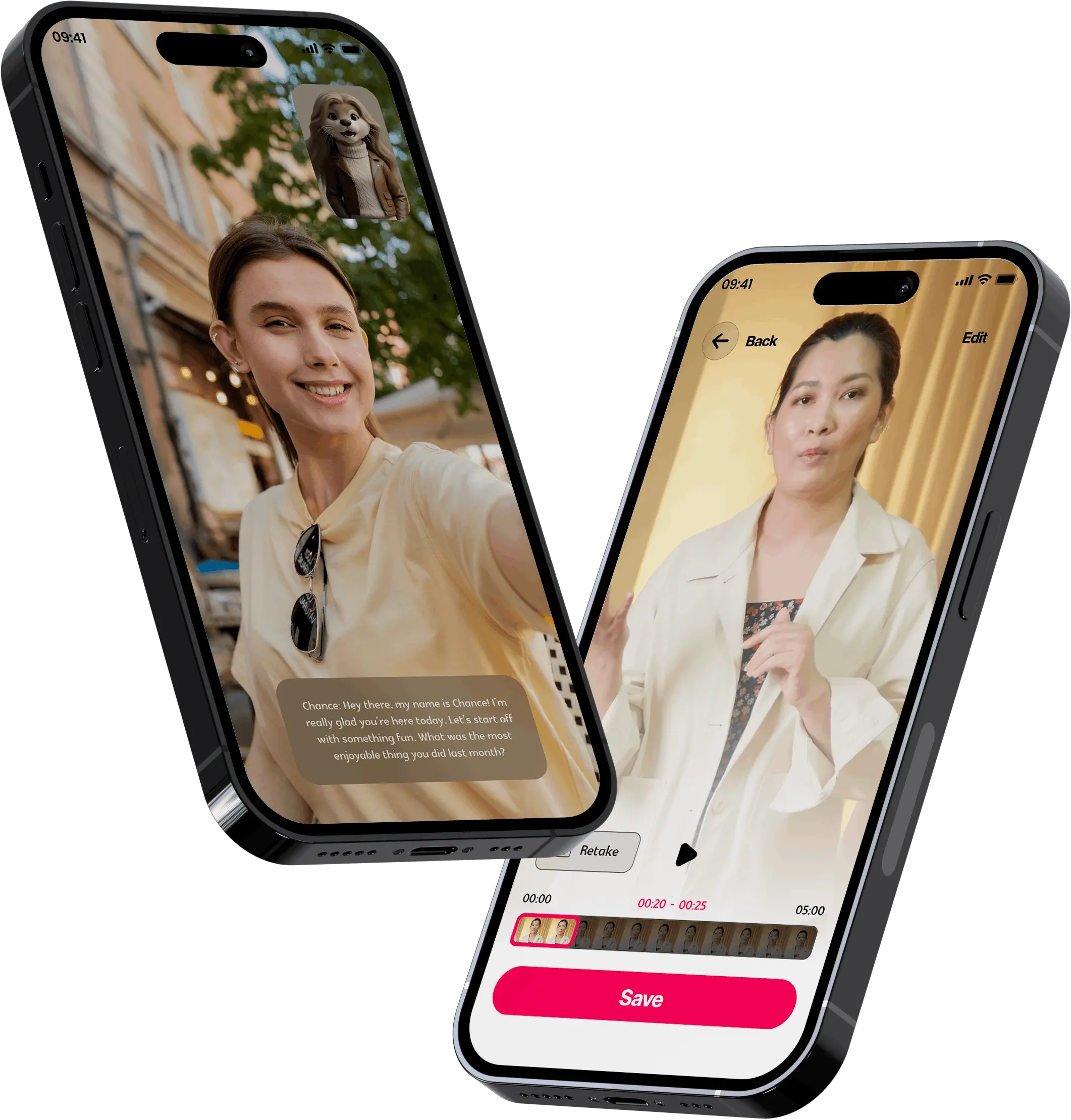
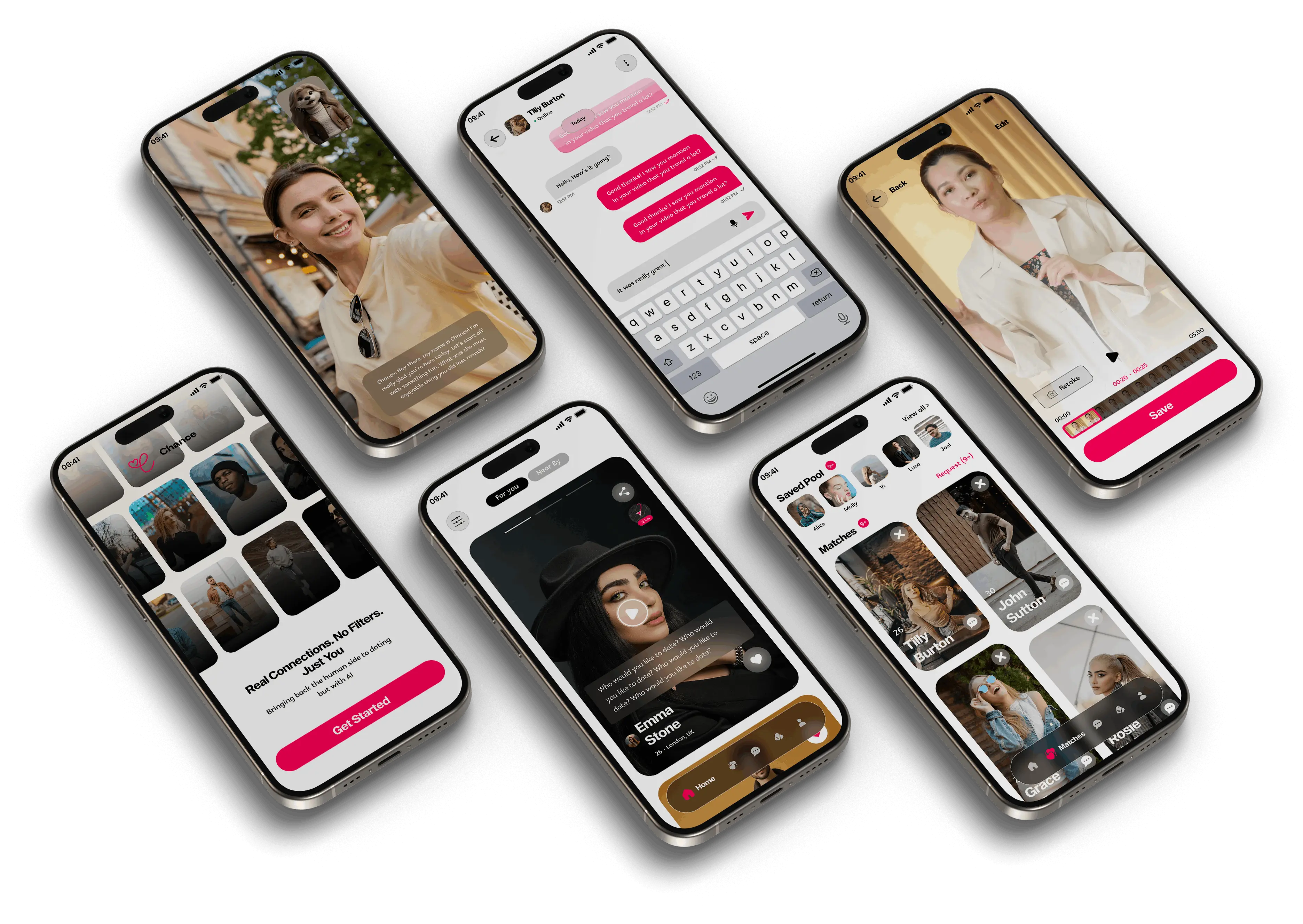
The product's answer is a five-question AI interview that turns raw video answers into a polished profile reel. My job was to make recording video feel like the easiest thing in the app rather than the most exposing.
- 01Make the interview feel like a conversation. One question at a time, a friendly guide asking it, and nothing on screen that looks like a recording studio.
- 02Show the result before asking for commitment. People will record if they can see what it becomes, so the edited reel comes back quickly and can be redone without penalty.
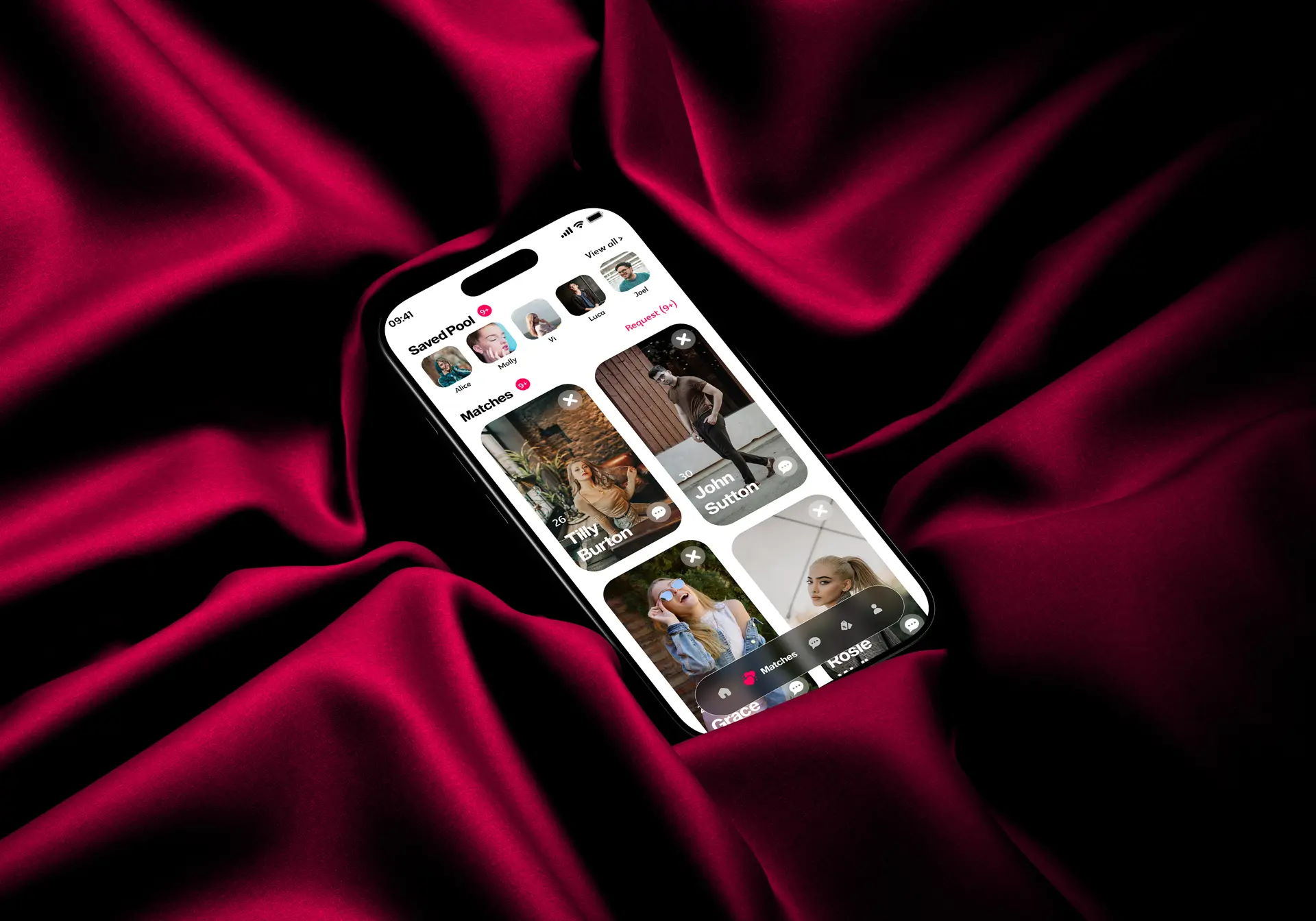
- 03Consent before contact. Chat opens only after both people accept, which turns safety into the structure of the product rather than a setting buried in a menu.
The design work then concentrated on three things:
- 01A signup that reaches the first question fast, because every screen before it is a reason to leave.
- 02Compatibility shown as reasons rather than a score, since a percentage invites an argument and a reason invites a decision.
- 03A consistent system across interview, reels, matching and chat, so the AI parts do not feel bolted onto a normal dating app.
03What Actually Happened
The interview flow took the most iteration by far.
My first version presented all five questions up front so people knew what they were in for. It read as a test. Everyone I showed it to focused on preparing answers rather than giving them, which is precisely the behaviour the product exists to avoid. Revealing one question at a time, with a visible sense of how far along you are, produced far more natural responses.
The compatibility view also changed. My first pass displayed a match percentage, which looked convincing and was quietly misleading. A number implies a precision the model does not have, and it invites people to compare strangers by decimal points. Replacing it with plain-language reasons was less impressive on screen and considerably more useful.
The rest was iteration with the team on timing: how long a reel should run, how quickly a result should come back, how much to say while someone waits.
04What Changed
Chance shipped on iOS and Android.
What the design had to prove
- 01That recording a short video could feel easier than filling in a profile.
- 02That consent-first messaging would read as respect rather than restriction.
- 03That a reason is more persuasive than a percentage.
The interview is the piece I am most pleased with, because the whole product depends on people being willing to start it.
05What I Had to Work With
Those are the reasons the product leans on sequence and tone rather than on features.
- 01Video is exposing. Asking for it early is the boldest thing this app does, and no amount of interface polish removes the nerve required.
- 02AI output is variable. The design had to hold up when the model produces something mediocre, not only when the demo goes well.
- 03Safety competes with engagement. Consent-based chat deliberately reduces message volume, so the experience had to be good enough to justify that trade.
06What I'd Do Differently
I would prototype with real recordings much sooner. Video flows behave differently once actual people, actual lighting and actual self-consciousness are involved, and no static prototype predicts that.
I would also design the failure states alongside the happy path, like a reel that comes back badly or an interview interrupted halfway. Those are common, and they were the last thing I drew rather than the first.
What I Learned
- 01Reveal, do not preview. Showing all five questions turned a conversation into an exam, and the only change was sequence.
- 02Precision you do not have is a lie. A match percentage looks better and says less than a sentence explaining the match.
- 03Safety features are experience features. Consent-first chat is the reason the conversations are worth having, not a tax on having them.