Making construction cost control legible to everyone who signs off on it.
- Industry
- Construction
- Product
- Web App
- Platform
- Web
- Year
- 2025
01The Real Problem
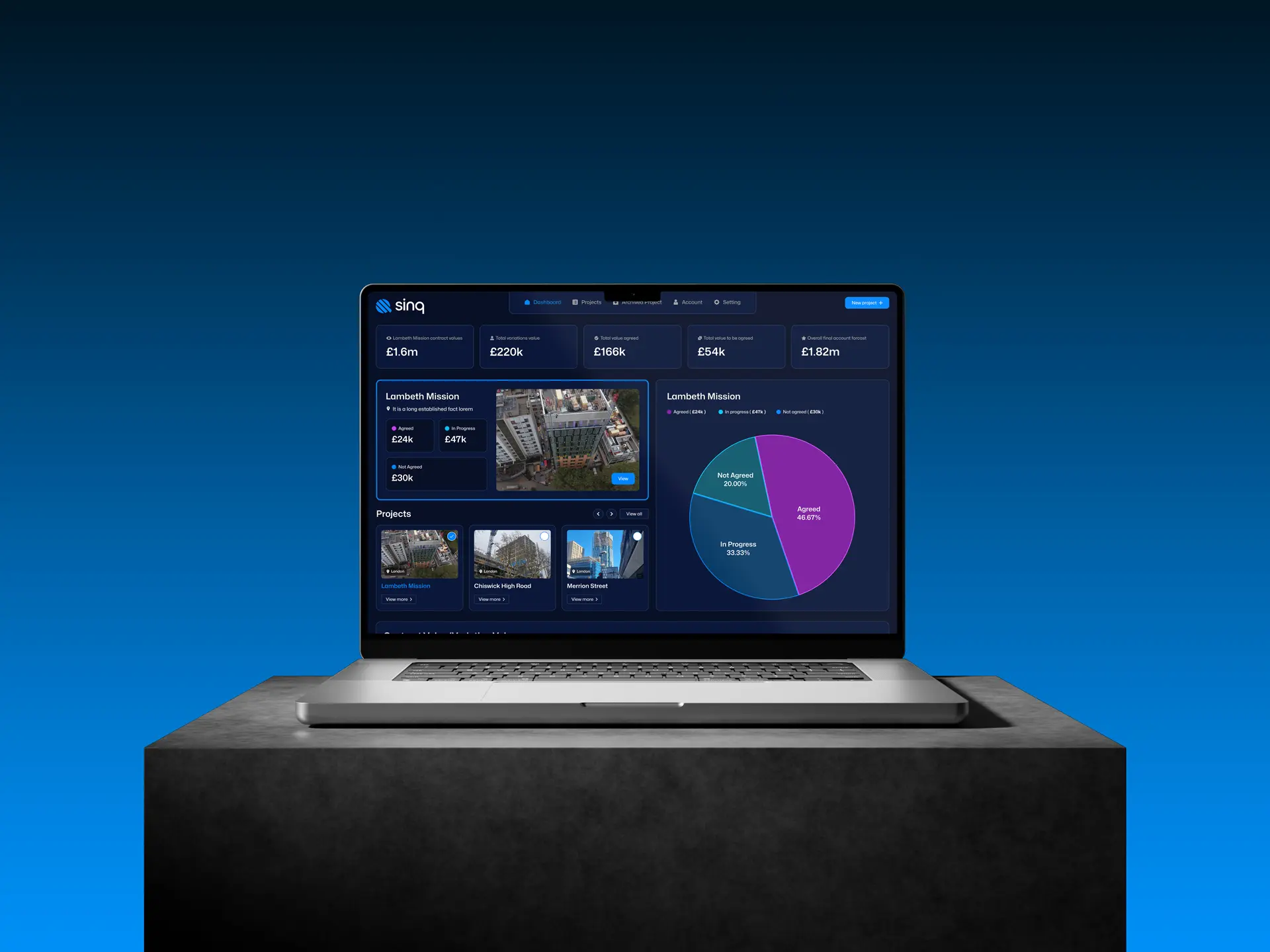
Sinq is a cost control and quotation platform for main contractors. Quotations, variations, approvals and the money attached to all of them, in one place, on a live project.
Before it, that work lived in spreadsheets, email threads and phone calls. The failure is not that this is inefficient. Everyone knows it is inefficient. The failure is that nobody can answer a simple question with confidence: what is this project's exposure right now? Variations get agreed verbally on site and confirmed weeks later, so the recorded number and the real number drift apart, and the gap only becomes visible when it is expensive.
So the design questions were:
- 01How do you show the state of money on a project in one screen, honestly?
- 02How do you record an approval so it cannot be argued about later?
- 03How does a supervisor on site use this without stopping what they are doing?
02Finding the Fix
The idea that organised everything came out of the interviews with contractors and quantity surveyors: cost is not one number, it is three, and the difference between them is the whole story.
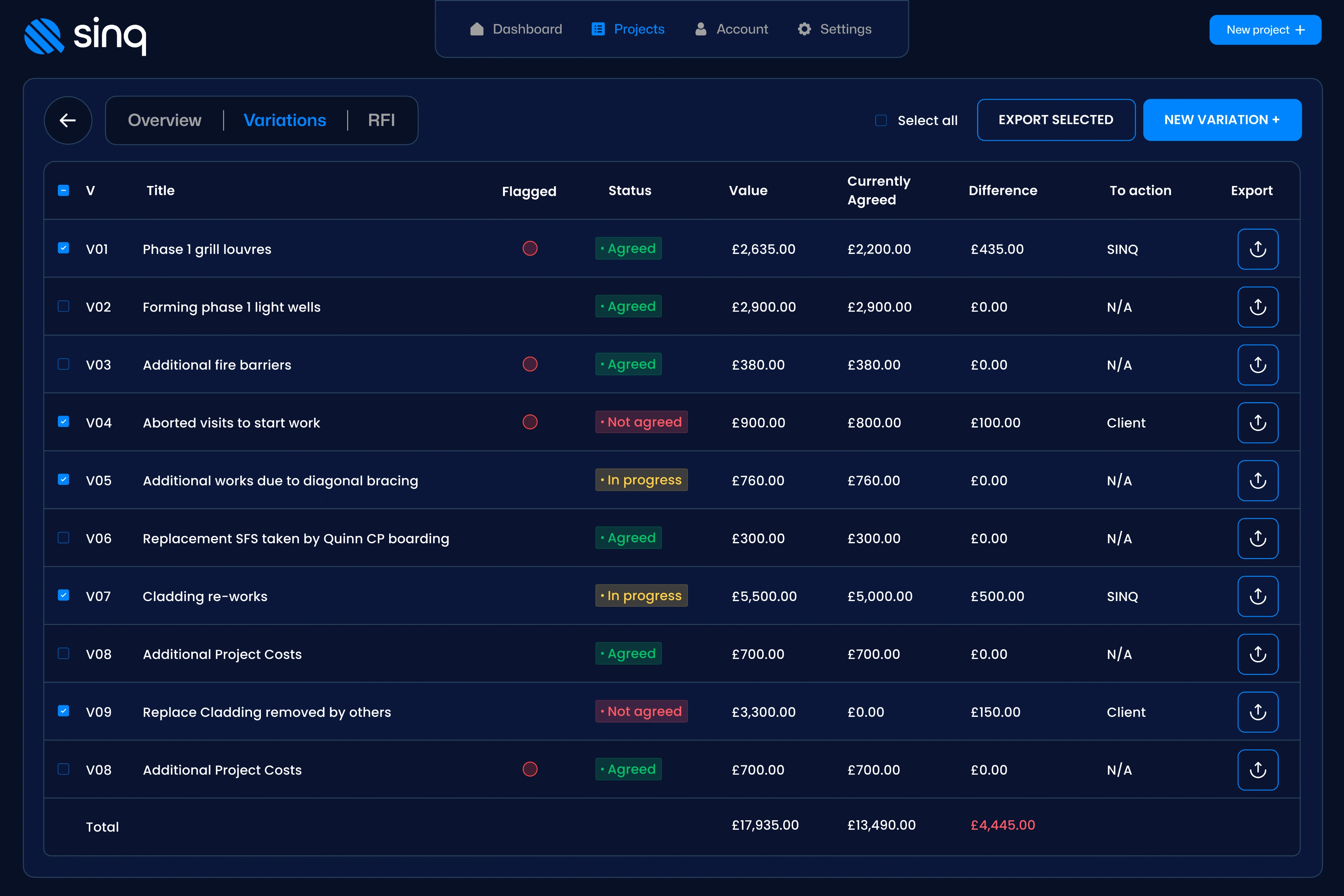
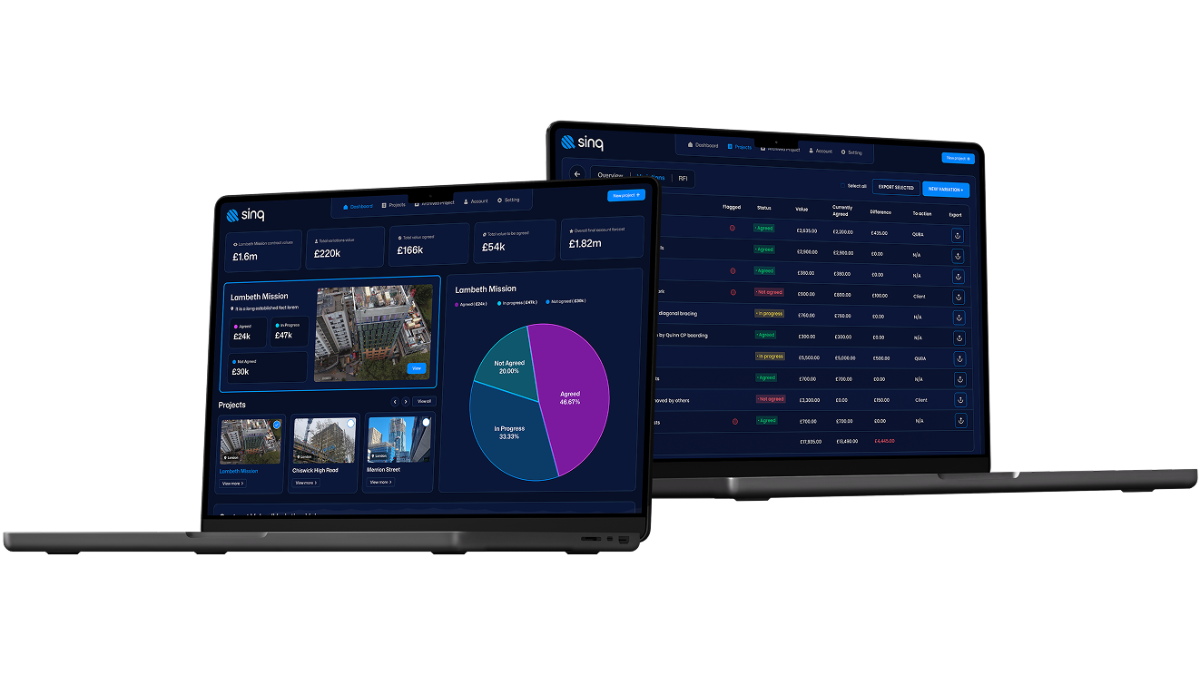
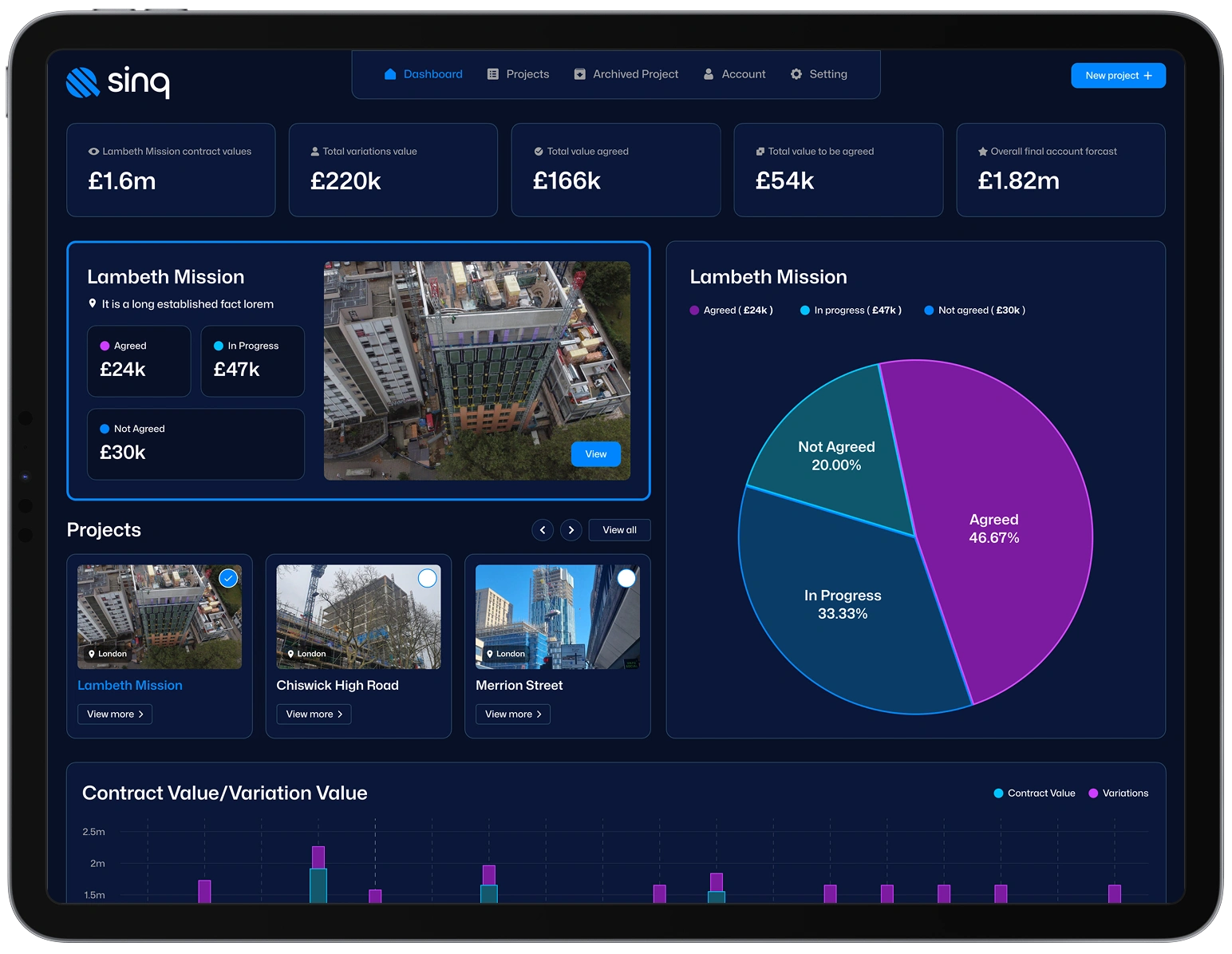
- 01Agreed, in progress, not agreed. Every figure on the platform carries its status, so the dashboard shows certainty and exposure side by side rather than a single misleading total.
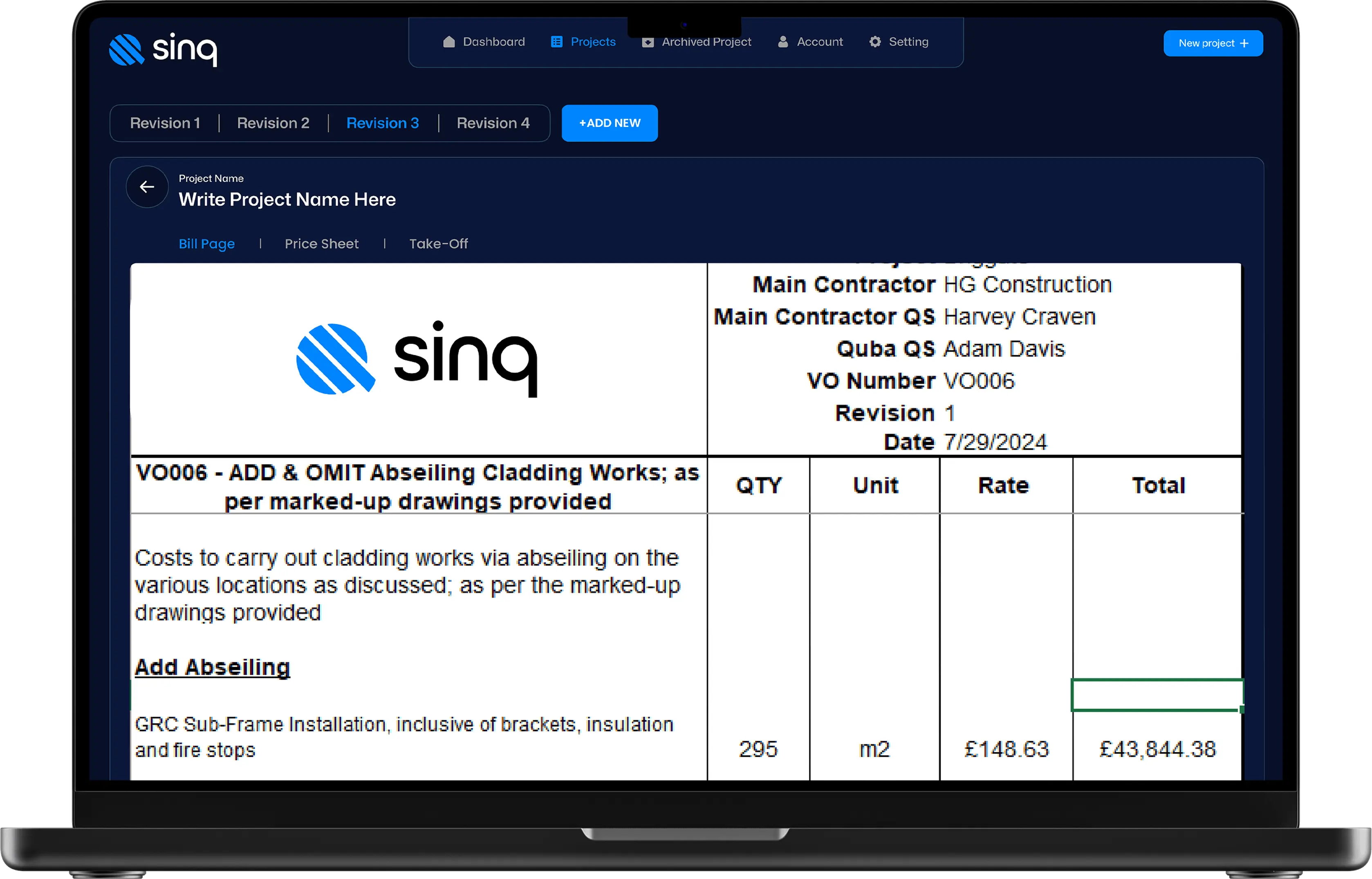
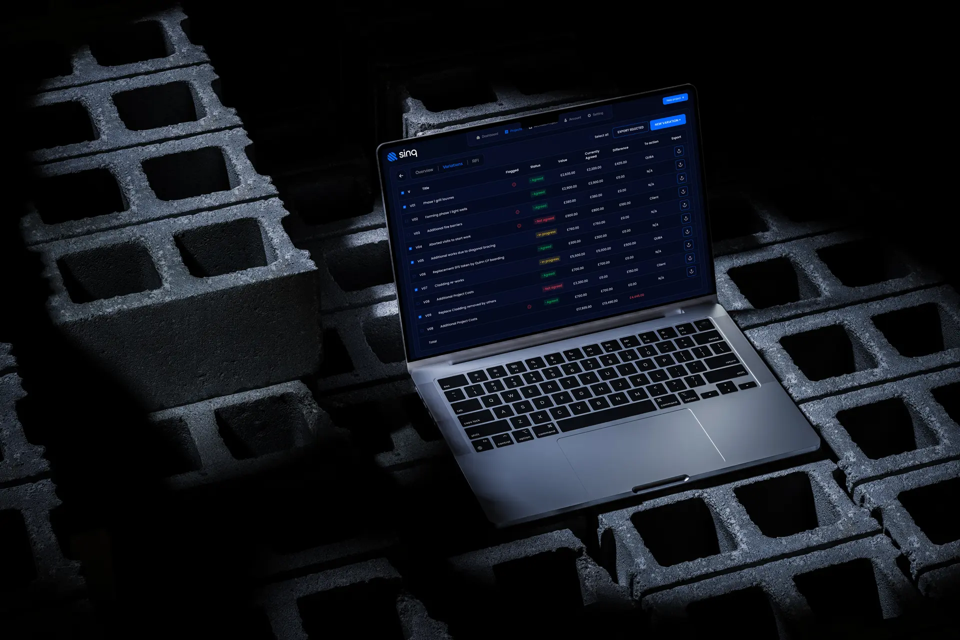
- 02An approval is a record, not a message. Who approved what, when, against which version, captured as a first-class object rather than an email nobody can find.
- 03Two products, one system. The office needs depth on a big screen; site needs three taps in the rain. Same data, deliberately different interfaces.
The design work then concentrated on three things:
- 01Dashboards that lead with status breakdown and only then with totals, because a total without status is the thing that misleads people today.
- 02A variation flow that is faster to complete properly than to postpone, since anything slower gets done later and later means never.
- 03Role-based views, so a supervisor, a surveyor and a director each open the screen that matches their decision.
03What Actually Happened
We ran the work in short cycles with real contractors reviewing after each one, which changed the design repeatedly and for the better.
The dashboard was my clearest mistake. My first version led with a single contract value, because that is the number people ask for. Contractors immediately pointed out it was the number that causes the arguments: it hides how much is agreed and how much is merely hoped for. Splitting it into agreed, in progress and not agreed made the same screen tell the truth.
The mobile app also shrank. My first version was a smaller copy of the web platform, which is the standard mistake. A supervisor on site is not doing cost analysis; they are raising a query about something in front of them. Cutting the app back to that one job made it usable.
The rest was steady refinement of the approval flow, which is where most of the platform's value sits and where every edge case lives.
04What Changed
Sinq is deployed on live projects, and cost reporting that used to take days now happens in real time, around 60% faster by the client's own measure.
What the design had to deliver
- 01One honest picture of exposure, not one flattering total.
- 02Approvals that hold up when someone disputes them.
- 03A site app fast enough to use standing up.
The agreed / in progress / not agreed split is the piece I am most pleased with, because it is a design decision that changes what people can know.
05What I Had to Work With
Those constraints are the reason the platform is structured rather than flexible: structure is what a spreadsheet cannot give you, and it is the only thing worth switching for.
- 01A domain I had to learn. Variations, valuations and retention have precise meanings in construction, and getting the language wrong loses the user immediately.
- 02Spreadsheets are the competition. They are flexible and familiar, so anything slower or more rigid than a spreadsheet simply does not get adopted.
- 03Site conditions. Gloves, glare, bad signal, no patience. The mobile app had to work in the worst conditions of any product I have designed.
06What I'd Do Differently
I would visit a site before drawing the mobile app rather than after. Everything I got wrong there came from imagining a phone in an office instead of a phone in a pocket in the rain.
I would also design the reporting output earlier. Reports are how this platform proves its value to the people who pay for it, and I treated them as an end-of-project task rather than a core screen.
What I Learned
- 01A single number can be a design bug. Splitting the total by status did more for trust in the platform than any visual improvement.
- 02Mobile is a different product, not a smaller one. The site app got good the moment I stopped porting the web app into it.
- 03Learn the vocabulary before proposing anything. In a specialist domain, precise language is most of the credibility, and you cannot design your way around getting it wrong.