Making puberty and period care feel calm, clear and worth talking about.
- Industry
- Healthcare
- Product
- Mobile App
- Platform
- App
- Year
- 2025
01The Real Problem
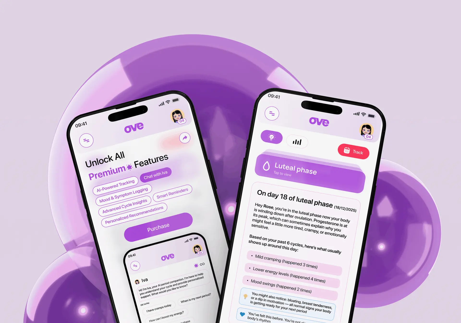
Ove set out to do three things in one app: teach people about puberty, track a cycle, and get period products into their hands. Each exists on its own already. Together they meant the product had to move between a teaching voice, a data-entry tool and a shop without ever feeling like three apps stapled into one.
The audience made that harder. Many people opening Ove are doing this for the first time: young, unsure, sometimes with a parent looking over their shoulder. Anything that read as clinical, or made them feel watched, was a reason to close the app and not come back.
So the brief came down to a few questions:
- 01How do you explain a first period without sounding like a textbook?
- 02How does tracking help when a young cycle is nowhere near regular yet?
- 03How does a shop sit inside a health app without feeling like an advert?
Answering those was less about screens and more about tone. The interface had to sound like a straightforward friend who happens to know the facts.
02Finding the Fix
I started by mapping the whole product as one journey rather than three modules, and looking at where a person actually crosses between them. Three things shaped the design:
Learning comes first. Lessons and quizzes lead, not a tab behind the tracker.
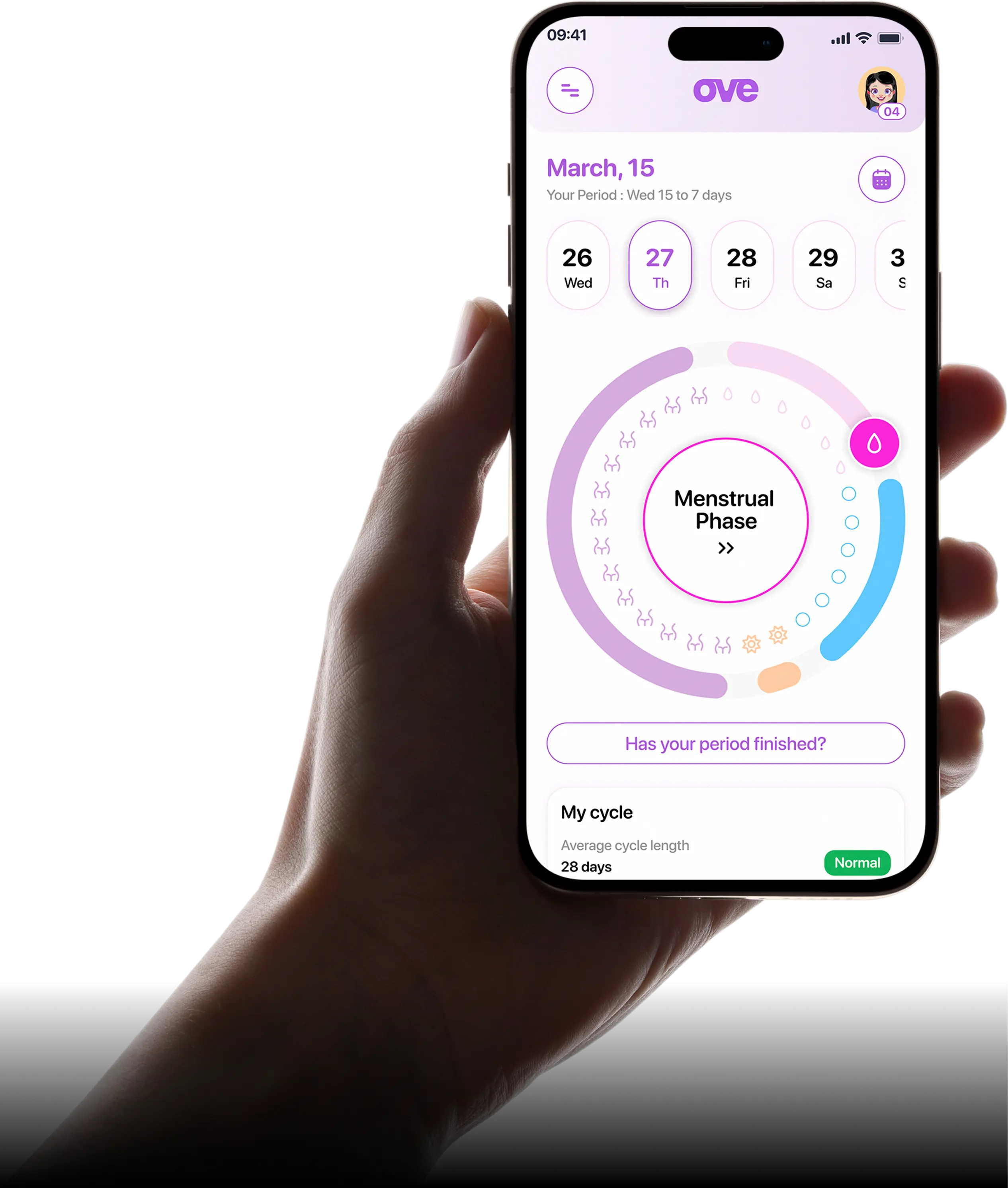
Tracking has to forgive. Irregular cycles are normal here, so the app teaches phases, not errors.
The shop stays in service of the moment. Products arrive with how-to-use guides, so a first tampon is a lesson, not a sale.
That reordering did most of the work. Once learning led, the tracker stopped feeling like homework and started reading as the place your own answers get recorded.
From there the design work concentrated on three things:
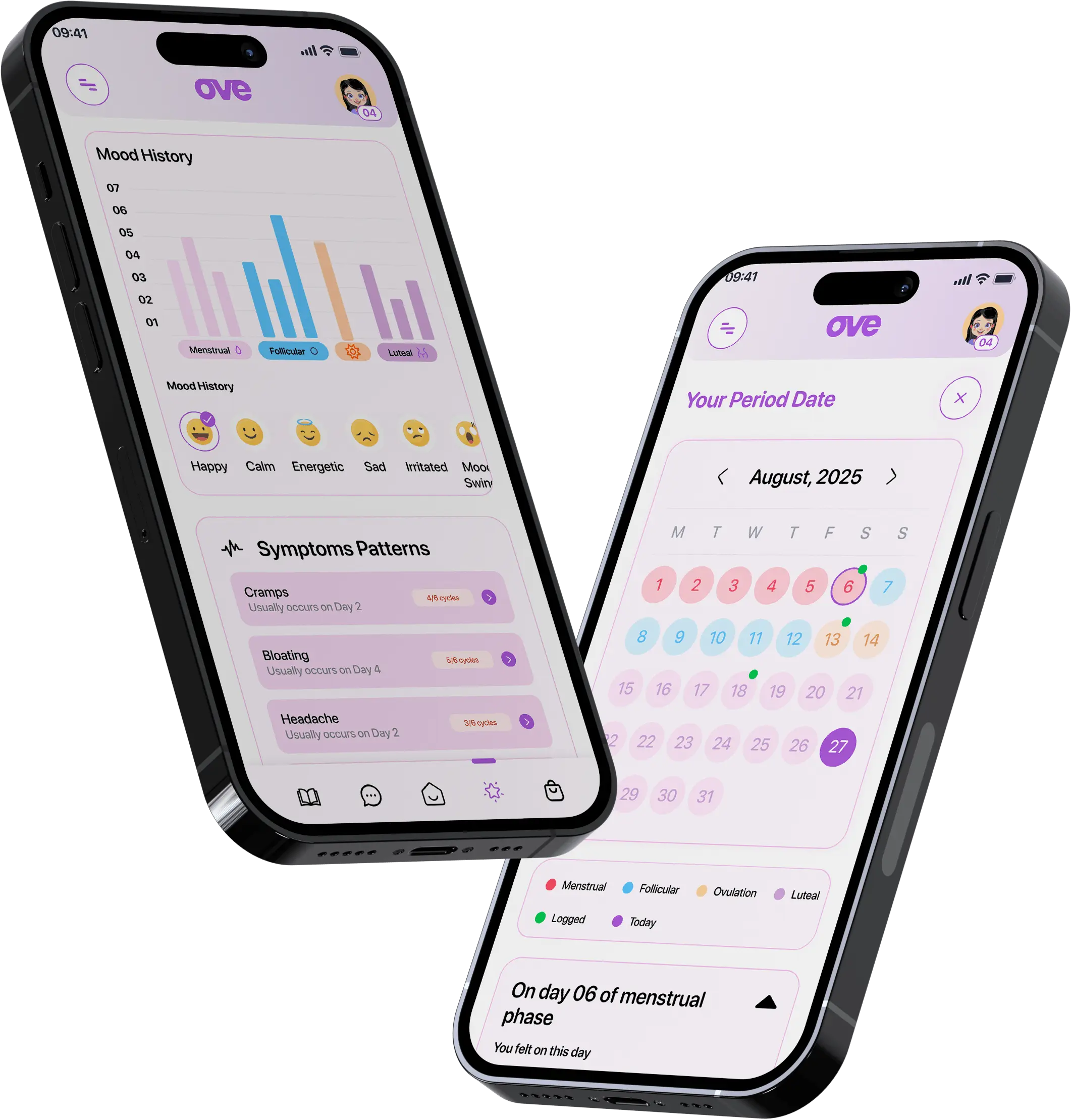
- 01A calm visual language: soft palette, generous spacing, plain words. Nothing coded in euphemism, nothing reading as a textbook.
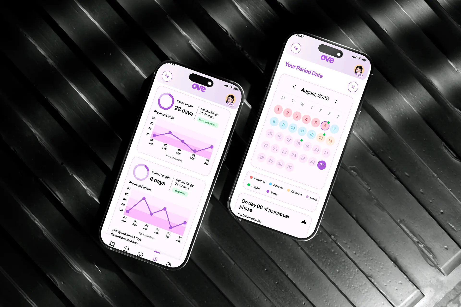
- 02Logging that takes seconds. Big targets, sensible defaults and no required fields, so a day is recorded in a single tap.
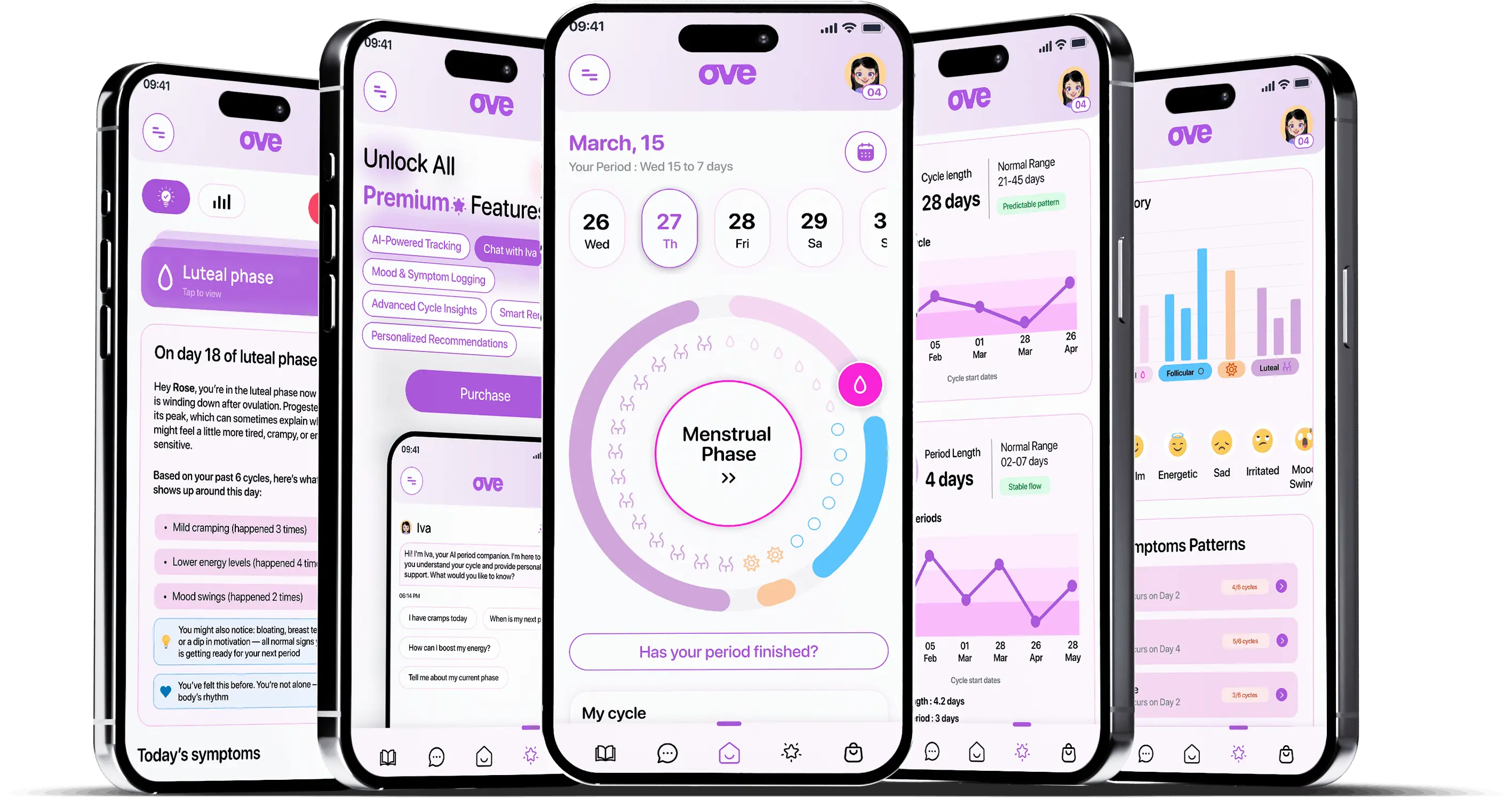
- 03One component library across lessons, tracker, Iva and shop, so moving between them reads as one product, not four.
All of it built to ship on mobile first, in Figma, ready for handoff.
03What Actually Happened
I wireframed the flows and reviewed them with the founder and the product team, then rebuilt the parts that were not landing.
The onboarding is the clearest example. My first version asked for cycle details up front, the way most tracking apps do. For someone who has not had a period yet, that is an immediate dead end. I reversed it: onboarding starts with where you are, and the app only asks for what it can actually use.
Illustration went through the same correction. My first pass was closer to a medical diagram: accurate, and nobody wanted to look at it. Softening it made the same information easier to sit with when a reader is eleven.
From there it was steady iteration with the development team: prototype, review, adjust, hand off, and revisit the pieces that changed once they were running on a real device.
04What Changed
Ove shipped on the App Store and Google Play. What I am most pleased with is not a screen. It is that lessons, tracker, Iva and shop ended up as one continuous experience, which is the thing that made the product worth building.
What the design set out to be
- 01Clear enough for a first-time reader, without talking down to them.
- 02Quick enough to log a day without thinking about it.
- 03Calm enough that the subject stops feeling like something to hide.
Those three were the bar every screen had to clear before I handed it over.
05What I Had to Work With
Those constraints are the reason the product leans on tone and sequencing rather than density. There was no room for anything else.
A sensitive subject and a young audience. This is not a product where you can run casual usability sessions with whoever is nearby. Most of my input came through the founder and the product team rather than directly from users.
Three products in one. Education, tracking and commerce have very different interface conventions. Every pattern had to work in all three contexts or it created a seam.
Mobile first, and small. Everything had to survive a phone screen, which is a hard limit on how much explanation any one view can carry.
06What I'd Do Differently
I would push harder for direct contact with users, carefully and with the right safeguards. Designing a product about people's bodies through second-hand accounts got me to something good, but I am sure I missed things that only show up when you watch someone use it.
I would also lock the content model earlier. The education material kept growing while the layouts were being finalised, and a firmer structure up front would have saved a round of rework.
07What I Learned
Order is a design decision. Nothing about the individual screens changed when education moved ahead of tracking, but the product became far easier to walk into. Sequence did the work that no amount of visual polish would have.
Tone is part of usability. On a subject people are embarrassed to search for, a warm illustration and a plainly worded label do the same work as a well-placed button. Get the tone wrong and the flow is never used.
Defaults carry the product. Most people will never open settings. Deciding what the app assumes, what it asks and what it leaves alone shaped the experience more than any single screen I drew.
Ove is live at ovecare.com, on iOS and Android.